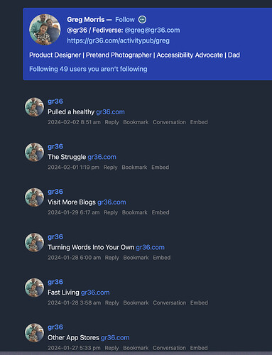
To illustrate what I mean, I took this screenshot from visiting Greg Morris’s (great) blog via Micro.blog:
To me, long posts with titles is like the crème de la crème of posts ![]() - so I feel this default format is very underwhelming. (
- so I feel this default format is very underwhelming. (![]() That’s a list of nice blog posts, but on the timeline it looks really boring.)
That’s a list of nice blog posts, but on the timeline it looks really boring.)
They’re also important posts, right? Isn’t this where replies gets gathered for showing on the main blog site? (If I have that turned on.) So if I made a separate post, where I said:
New blog post! (and a link)
Summary summary summary summary summary summary summary summary summary summary summary summary summary summary summary summary summary summary summary summary summary summary.
Nice image
and if people replied to that post, it wouldn’t get shown on the website..?
Reading Timeline display rules, I don’t quite know why long posts with title (LPWT) gets the harshest treatment, heh.
I don’t know if this is technically correct, but in practise it seems like there’s two versions of every post. Let’s call them the Blog version and the Timeline version.
The blog version is always the real deal - and then the timeline version is some kind of image, more or less distorted, of the real thing.
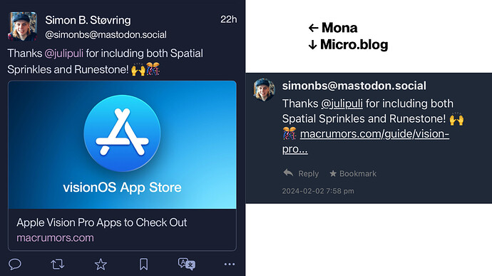
- ≤300 characters, no title: More or less the same as the blog version (probably some stripped html though?)
- ≥301 characters, no title: Gets truncated, and strips away styling and images - even before the truncation point (is that a word?).
- Any length, with a title: Just the title and a link. No images no nothing.
To continue with the “image quality” metaphor, it feels like ![]() :
:
- ≤300 characters, no title = 4k DSLR photo
- ≥301 characters, no title= 720p mobile photo
- Any length, with a title = 360p potato photo
Here’s my wish list:
Now, I’m just a newbie[1]… And there’s probably both technical, cultural and logical reasons why these a bad ideas - but I’m airing them anyway! ![]() They’re not a package, so should be evaluated individually.
They’re not a package, so should be evaluated individually.
1) Improve the way posts with title appear on the timeline
A starting point could be to do something like this:
- Grab the title, make it just bold text with a hyperlink to the full blog post.
- Provide the start of the article (while keeping as much formatting as with regular short posts - 4k resolution, baby!), within some limit.
- If step 2 didn’t provide the entire post, add (…) at the end (without breaking up a word), that also sends you to the blog post.
- Add the first image from the post.
So, instead of this:
We’d get something like this:
Seeing as I’m (obviously) allowed to take up that much space with a regular “short post”, I don’t think it’s too much to ask that a long post gets the same.
A second step could be to make the different parts of the timeline version editable, so you’d get 4 elements:
- Timeline title
- Timeline summary
- Timeline read more indicator (I chose (…) because it’s language independent)
- Timeline image
2) Increase the 300 limit
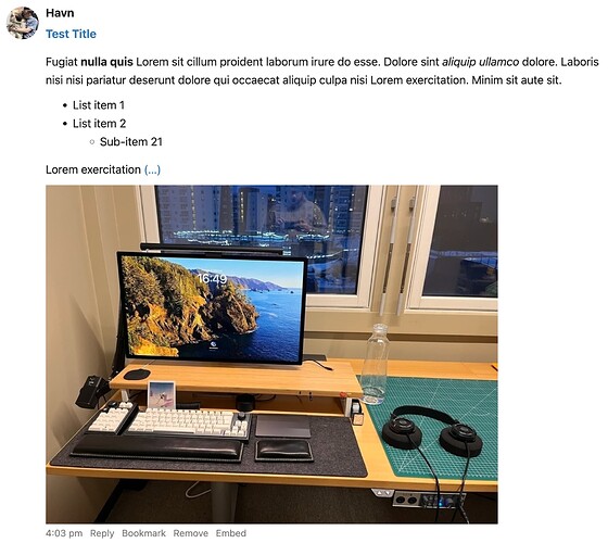
But I still think the 300 limit is way too harsh! Here’s a post within the limits:
Image, formatting, list looking good - nice!
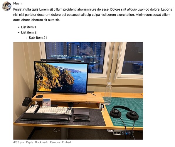
And then I add just a bit more text:
![]()
Who gets a better experience from the second version? I get that it’s not wanted to have full blown blog posts taking up the entire timeline - but why put the limit way below stuff like Mastodon, and create a bunch of extra clicks all over Micro.blog and the rest of the fediverse..? ![]()
So, my petition is: ![]()
![]()
- Increase the “image quality” of the 360p and 720p images,
- and allow more stuff to get the 4k treatment.
(Writing this post, and doing the experiements, really helped me understand how Micro.blog functions at the moment - and that lead to thoughts about how it seems to me it should function, heh.)
I’m someone who wants to move to Micro.blog to get more writing freedom than I’m experiencing on Mastodon. And I’m currently a bit disappointed, as there seems to be a bunch of weird stuff I need to think about…
 ↩︎
↩︎


