I’ll make the simple argument-- I don’t want to write summaries for posts and I don’t think the first X characters of a post with a title translates to the correct preview content. Showing a random 300-500 characters that start my post that is suddenly cutoff doesn’t seem great to me. I spend (minimal) time writing a title to let people know what it’s about. I don’t want to have a second step spending time writing another paragraph about what my two paragraph post is about. I don’t want to have to reread my post and figure out if the opening is the opening that many people may only see.
Well, I don’t see why you shouldn’t be able to turn off the feature if you wanted, though - even though I disagree that “just a title” is better than this. ![]()
Hello, AI ![]()
Given what I know about Manton, I don’t think this is true. i.e., I don’t think Micro.blog is putting a finger on the scale for micro posts. The Community (Timeline) part sure makes it seem that way but the Hosting (business end) is not. Hence I’ve always sensed a struggle between those two parts.
2 Likes
I’m finally catching up on the more recent posts in this thread, and there’s a lot! Thank you everyone. I’m going to be thinking about this a little more.
There are also some long-standing issues that were not intended to be forever, such as stripping styling in a post when it is truncated. It was a technical shortcut to avoid accidentally truncating tags in the middle of a style run, or introducing related problems with lots of nested HTML tags. We have a lot more experience with this kind of thing now, so I’m ready to solve it.
Better display of multiple photos is another one. Basically, I think there’s some low-hanging fruit we can fix that should make a nice difference, even if it doesn’t significantly change the timeline for long titled posts, for now.
3 Likes
Hah, thanks for making it through my ramblings! ![]()
I hope you see the love for what Micro.blog already provides, in the enthusiasm for it getting even better. ![]()
Good to hear that you’re thinking about the truncation!
But may I ask why you won’t change the way titled posts looks on the timeline?
Let me make it a bit easier to understand what I’m asking for, by summing up my (most important) wish here[1] ![]() :
:
Make “everyone” happy, by giving the following drop-down menu, with two choices:
(Either under Design or Account/Timeline.)
Choose how your titled posts appear on the timeline.
- A: Only the title, with a link to the full posts.
- B: Title + Beginning of the post + First image
Option A could be solved in two different ways: ![]()
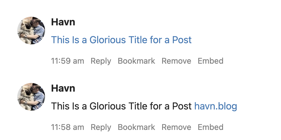
The bottom one is obviously how it is today - but I gotta say I prefer the top one. ![]() Not only does it take up even less space - it also makes it clear that the link takes you to the post, and not just the home page of the website.[2]
Not only does it take up even less space - it also makes it clear that the link takes you to the post, and not just the home page of the website.[2]
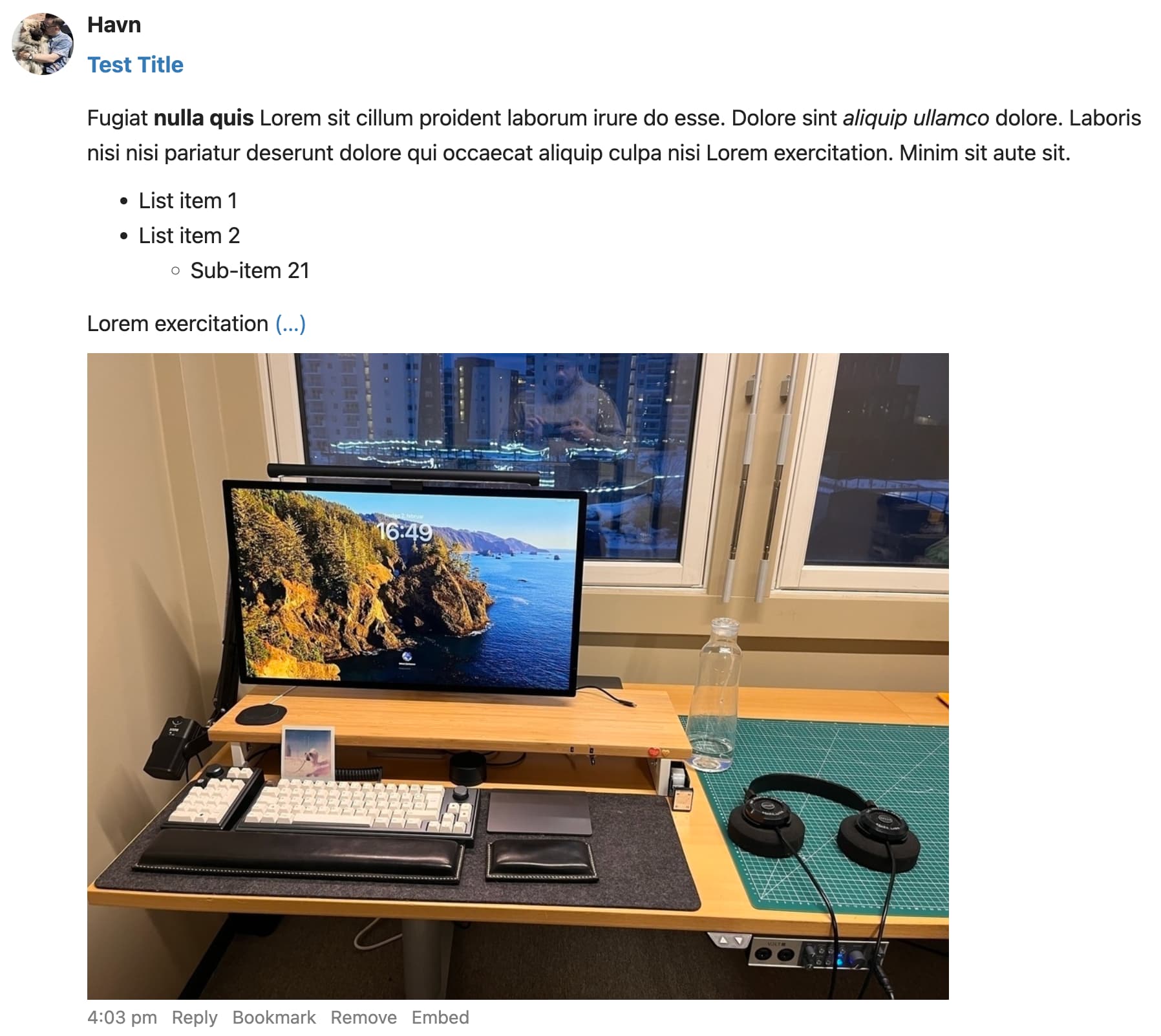
Option B I envision like this:
Having the first take on this feature be automatic and stick to the current timeline rules for posts without title, might not be optimal - but I imagine it’s way easier to implement.
The automation logic could go something like this:
- Take the title, make it bold[3] and a clickable link to the full post.
- Provide the start of the post, with formatting intact.[4]
- Then, if the whole post didn’t fit, add (…)[5] as another clickable link to the whole post.[6]
- Lastly, if there was no photos in step 2, provide the first image of the post.
I know I’m only one person - but as someone who really wants to merge my web presence into Micro.blog (and is fine with paying for it), I think I’m a member of a cohort where a bunch of potential MB customers are. And I know you value many things higher than “growth” - and that is one of the reasons I’m paying for MB!
But I still want you to understand, that when I’m considering clicking that big “Migrate” button from Mastodon, the fact that I know my Micro.blog posts will look terrible for the (few) people who follow me, does matter a bit.[7] ![]()
I’ll stick to things not requiring extra post UI. So even though being able to customise the timeline post would be neat, for instance, that’s something for later. ↩︎
As someone new to Micro.blog, I’ve found the latter a bit confusing - but this is far less important to me than being able to choose Option B! ↩︎
as headers isn’t supprted on the timeline - right? ↩︎
I’d go for 600 characters over 300 characters for the limit here. IMO, the most unique and important selling point of Micro.blog, as opposed to free things like Mastodon and Firefish, is in titled posts and longer writing. So I’d give those the treat of having the same limit as microposts with quotes.
 ↩︎
↩︎to make it language independent ↩︎
Add this after the more tag if there is one, and if not, after the limit. ↩︎
And here I’ll reinstate what I’ve said above: I have no plans to commercialise my writing or anything. But I still think it’s neat to have people read what I write and to have conversations about it! ↩︎
1 Like
As long as options remain to have the timeline remain a minimal dashboard, as it is, then I have no issue with options to expand it, though some of that seems like it’s not in the spirit of what the timeline is–in part it feels like trying to change the timeline into an RSS Reader or something—and, most importantly, it is so far down the list of my priorities for where limited dev resources go that it might as well not exist.
I don’t quite understand what you mean here: ![]()
If anything, the way the timeline works now, is more like an RSS reader (only showing the title of posts). And I’m suggesting making it a bit more like a social media timeline [1] - and let RSS readers be RSS readers. ![]()
To me, spending time in the timeline of Micro.blog is so much worse than other apps and services, that I don’t really touch it. And I think that should be a priority to improve, as we don’t only use social media to produce.
(But I love the blogging parts of MB, and the producing content through Ulysses.)
No, I don’t want it to be like Twitter/Instagram/TikTok… ↩︎
As I understand it, the Timeline is not intended to be the place for consumption of longer posts and it works well enough showing a minimal amount of content. Work spent making it something else, with expanded views for longer content, which RSS Readers already do well (if you are using one that only has one minimized viewing option, it sounds like you might want to change), and which I already use, is simply of a much lower priority for me than a very very long list of other improvements.
I understand what you are proposing, but since this is a thread where individuals are posting their opinions on an idea, I am merely sharing mine as one who doesn’t see things quite the same way you do and would prefer other development areas be prioritized.
What I meant about the RSS comparison, is that in a RSS reader, you get a list of posts (usually just the title and a very small preview), which you click to get the full article. And the Micro.blog kinda timeline works kinda like that now, since the long posts are just the title and a link, which then (on mobile) opens the browser (in-app or not) with the full content.
I’m not petitioning for it being the place to consume the longer post - but for it to be better for discovering longer posts. (And, I guess, for consuming medium posts (<600).)
In my suggestion for the expanded previews, there’s still a link-out! It’s just that it’s very easy to just scroll right by the minimal timeline posts long posts have now…
Yeah, absolutely! I find discussions like this both interesting and valuable. ![]()
I understand what you are proposing. Not sure what I can add to what I started with: those changes, if optional, wouldn’t bother me but I would rather see other development areas prioritized.
1 Like