Hah, thanks for making it through my ramblings! ![]()
I hope you see the love for what Micro.blog already provides, in the enthusiasm for it getting even better. ![]()
Good to hear that you’re thinking about the truncation!
But may I ask why you won’t change the way titled posts looks on the timeline?
Let me make it a bit easier to understand what I’m asking for, by summing up my (most important) wish here[1] ![]() :
:
Make “everyone” happy, by giving the following drop-down menu, with two choices:
(Either under Design or Account/Timeline.)
Choose how your titled posts appear on the timeline.
- A: Only the title, with a link to the full posts.
- B: Title + Beginning of the post + First image
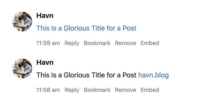
Option A could be solved in two different ways: ![]()
The bottom one is obviously how it is today - but I gotta say I prefer the top one. ![]() Not only does it take up even less space - it also makes it clear that the link takes you to the post, and not just the home page of the website.[2]
Not only does it take up even less space - it also makes it clear that the link takes you to the post, and not just the home page of the website.[2]
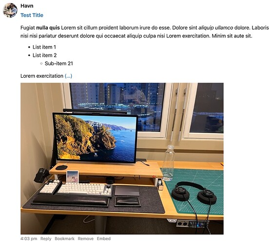
Option B I envision like this:
Having the first take on this feature be automatic and stick to the current timeline rules for posts without title, might not be optimal - but I imagine it’s way easier to implement.
The automation logic could go something like this:
- Take the title, make it bold[3] and a clickable link to the full post.
- Provide the start of the post, with formatting intact.[4]
- Then, if the whole post didn’t fit, add (…)[5] as another clickable link to the whole post.[6]
- Lastly, if there was no photos in step 2, provide the first image of the post.
I know I’m only one person - but as someone who really wants to merge my web presence into Micro.blog (and is fine with paying for it), I think I’m a member of a cohort where a bunch of potential MB customers are. And I know you value many things higher than “growth” - and that is one of the reasons I’m paying for MB!
But I still want you to understand, that when I’m considering clicking that big “Migrate” button from Mastodon, the fact that I know my Micro.blog posts will look terrible for the (few) people who follow me, does matter a bit.[7] ![]()
I’ll stick to things not requiring extra post UI. So even though being able to customise the timeline post would be neat, for instance, that’s something for later. ↩︎
As someone new to Micro.blog, I’ve found the latter a bit confusing - but this is far less important to me than being able to choose Option B! ↩︎
as headers isn’t supprted on the timeline - right? ↩︎
I’d go for 600 characters over 300 characters for the limit here. IMO, the most unique and important selling point of Micro.blog, as opposed to free things like Mastodon and Firefish, is in titled posts and longer writing. So I’d give those the treat of having the same limit as microposts with quotes.
 ↩︎
↩︎to make it language independent ↩︎
Add this after the more tag if there is one, and if not, after the limit. ↩︎
And here I’ll reinstate what I’ve said above: I have no plans to commercialise my writing or anything. But I still think it’s neat to have people read what I write and to have conversations about it! ↩︎

