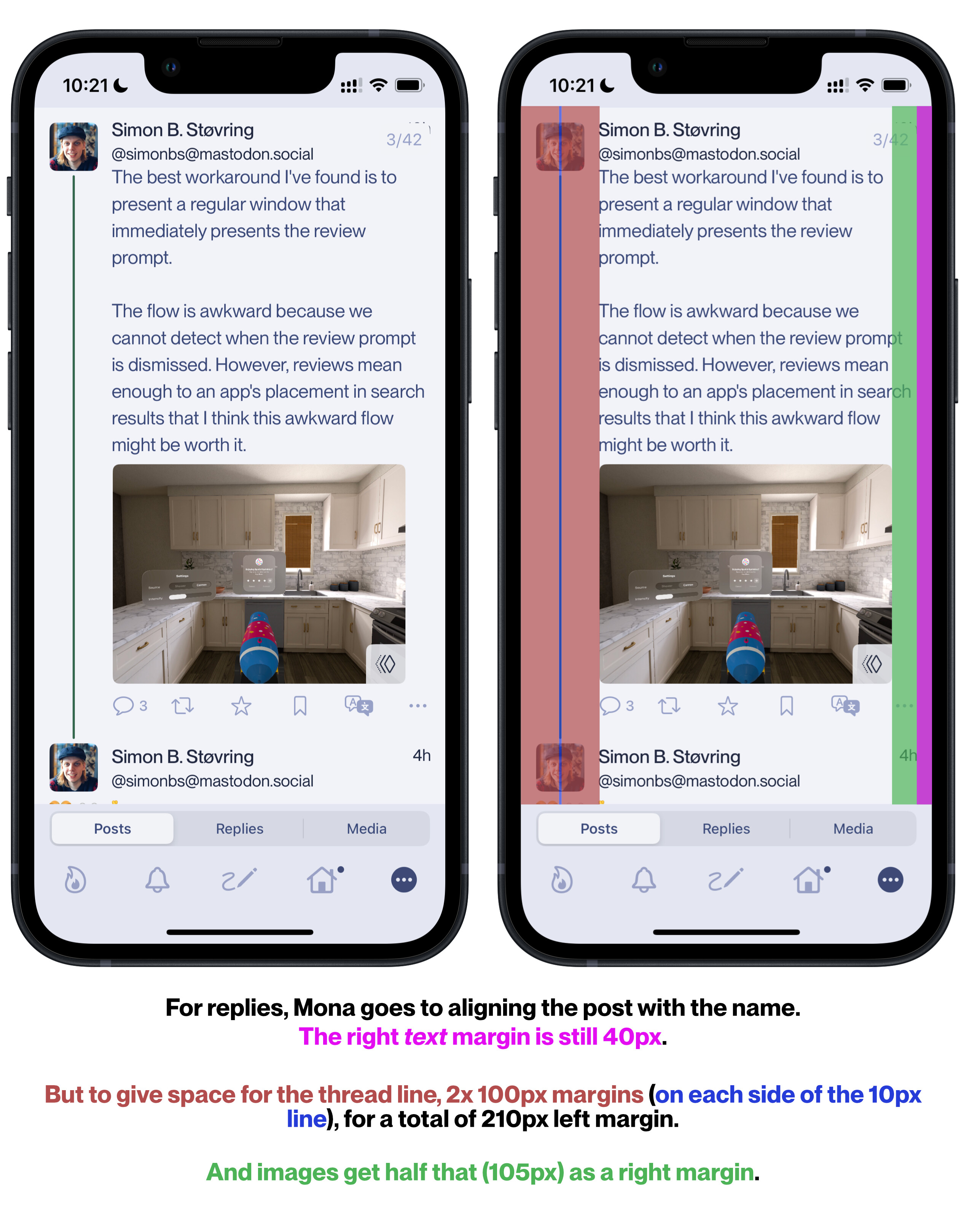
Yeah, it does line up the name and post text, but the other way lines the post text with the avatar. And having the large margins sacrifices a lot of space of smaller devices.
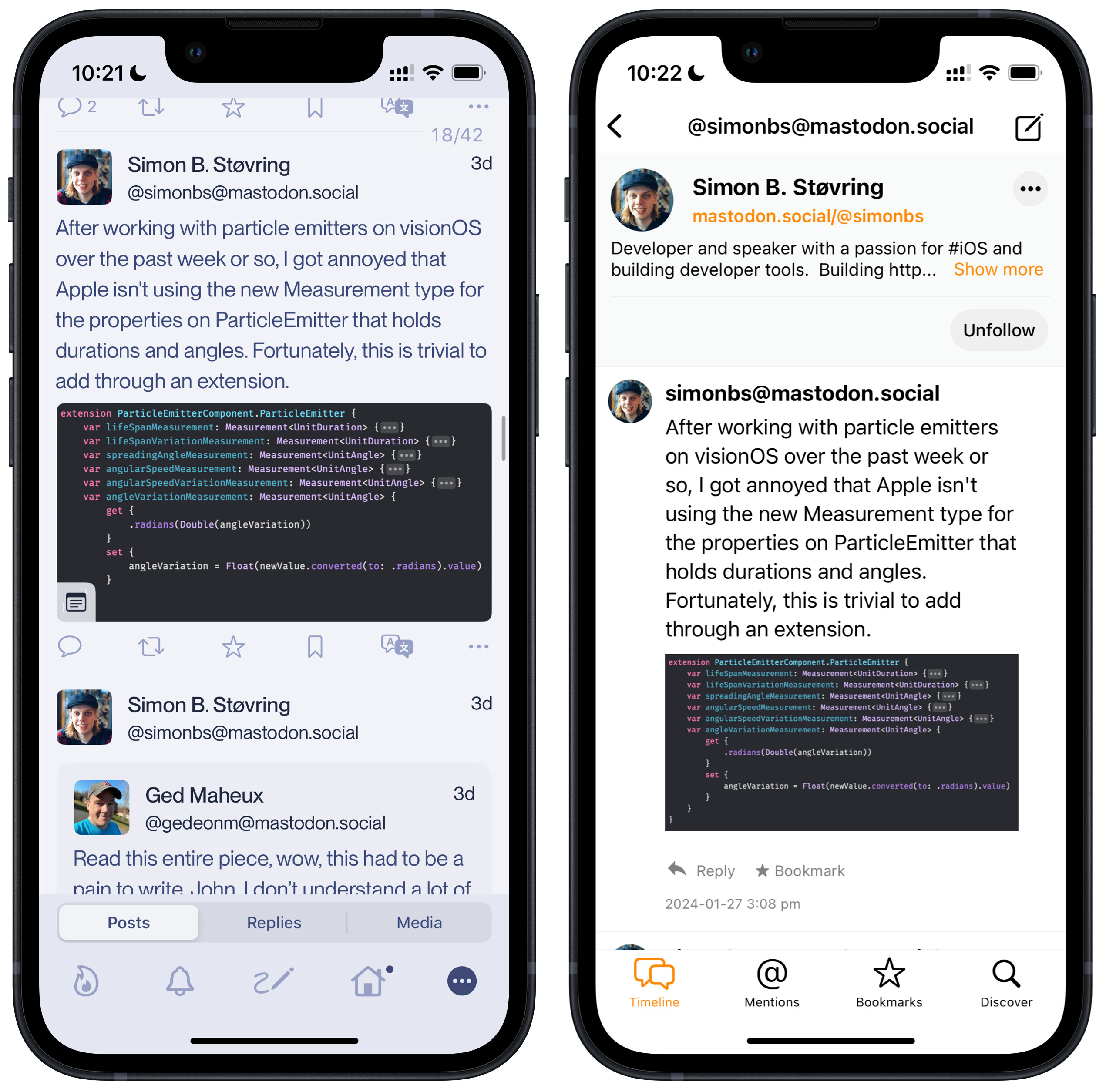
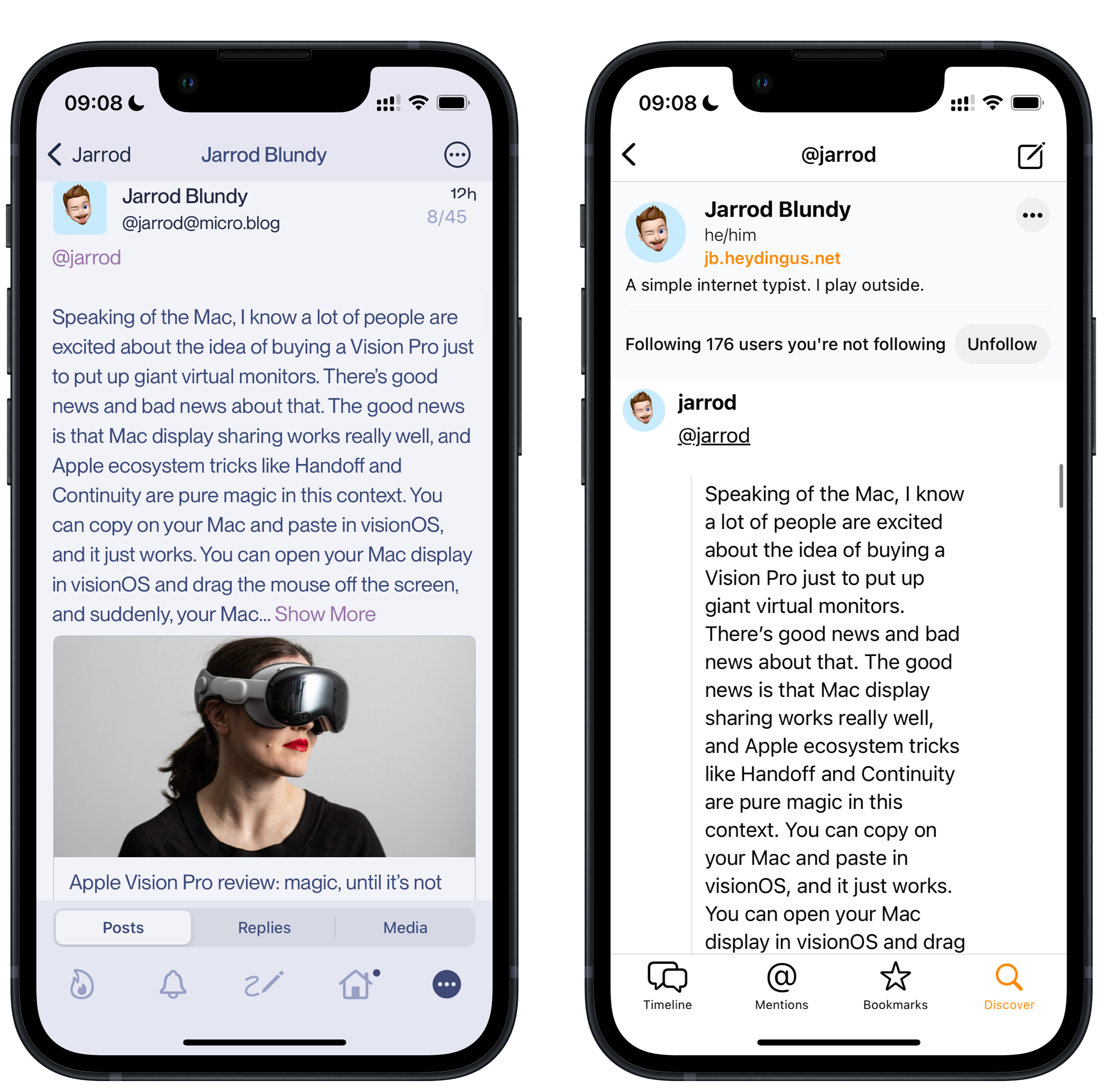
Let’s compare these two screenshots - from Mona and Micro.blog:
(With these Apple Frames screenshots, the Mini viewport is 1080 px - so that’s my benchmark.)
Now, my main point is that Micro.blog, in my opinion, wastes (precious) space. But before getting into just how much, keep in mind that:
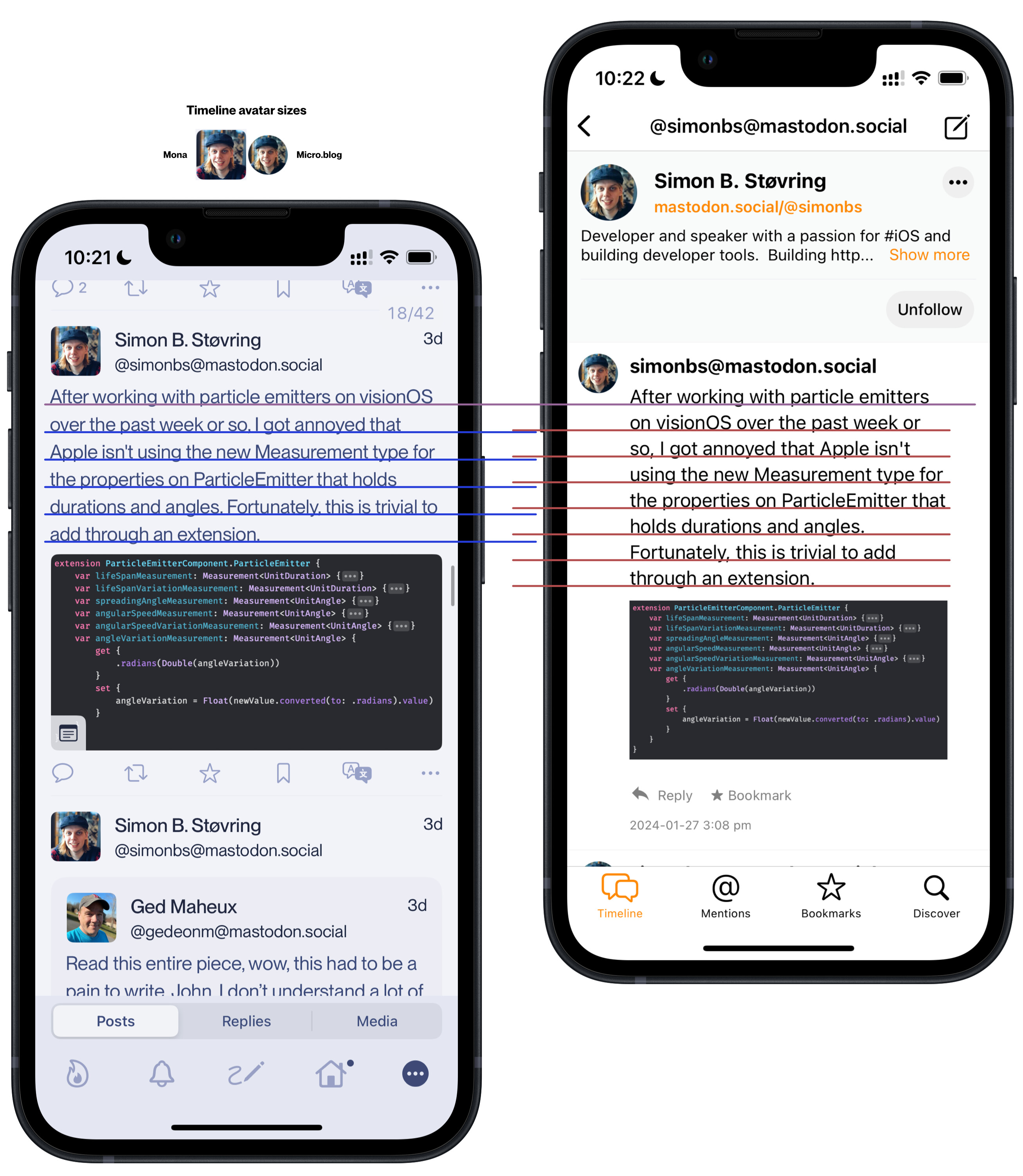
- Mona uses larger timeline avatars
- and slightly larger line spacing compared to Micro.blog.
So that this actually makes Micro.blog appear better, in terms of vertical space used.
Ok, but on to the margins!
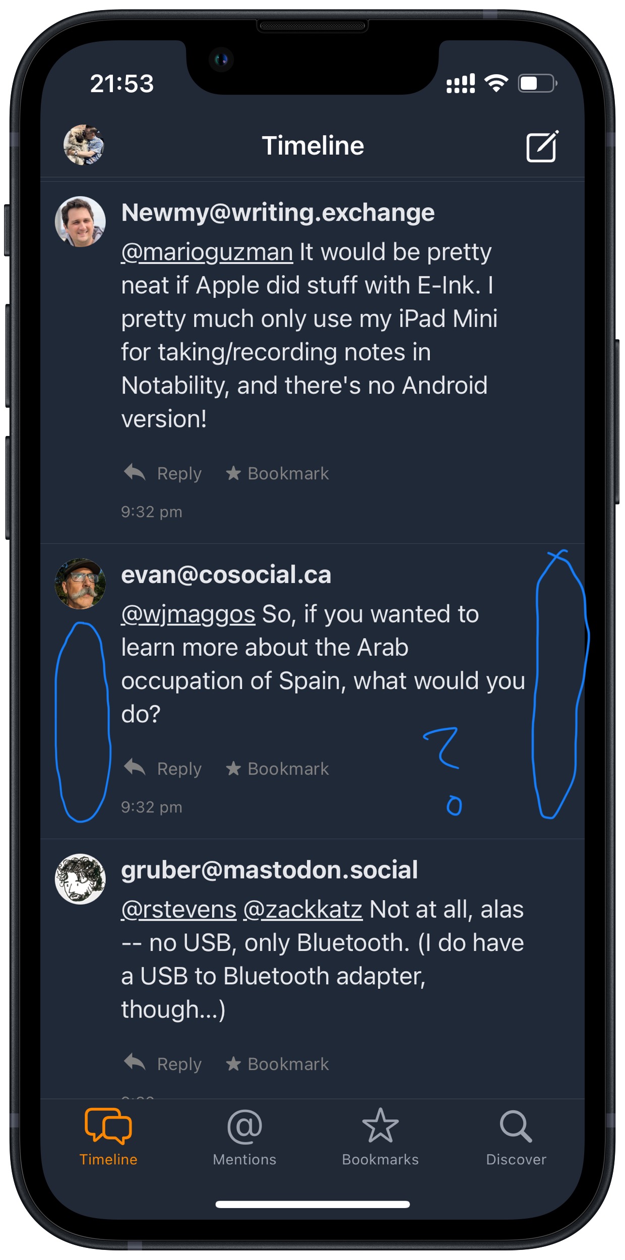
Mona’s margins:
40px gutters on each side, so
Margins = 80px ≈ 7,4 % of the vw
Content = 1000px ≈ 92,6 % of the vw
In this post, the text uses 400px of height, and 6 lines.
The image becomes 1000px x 503px = 503 000
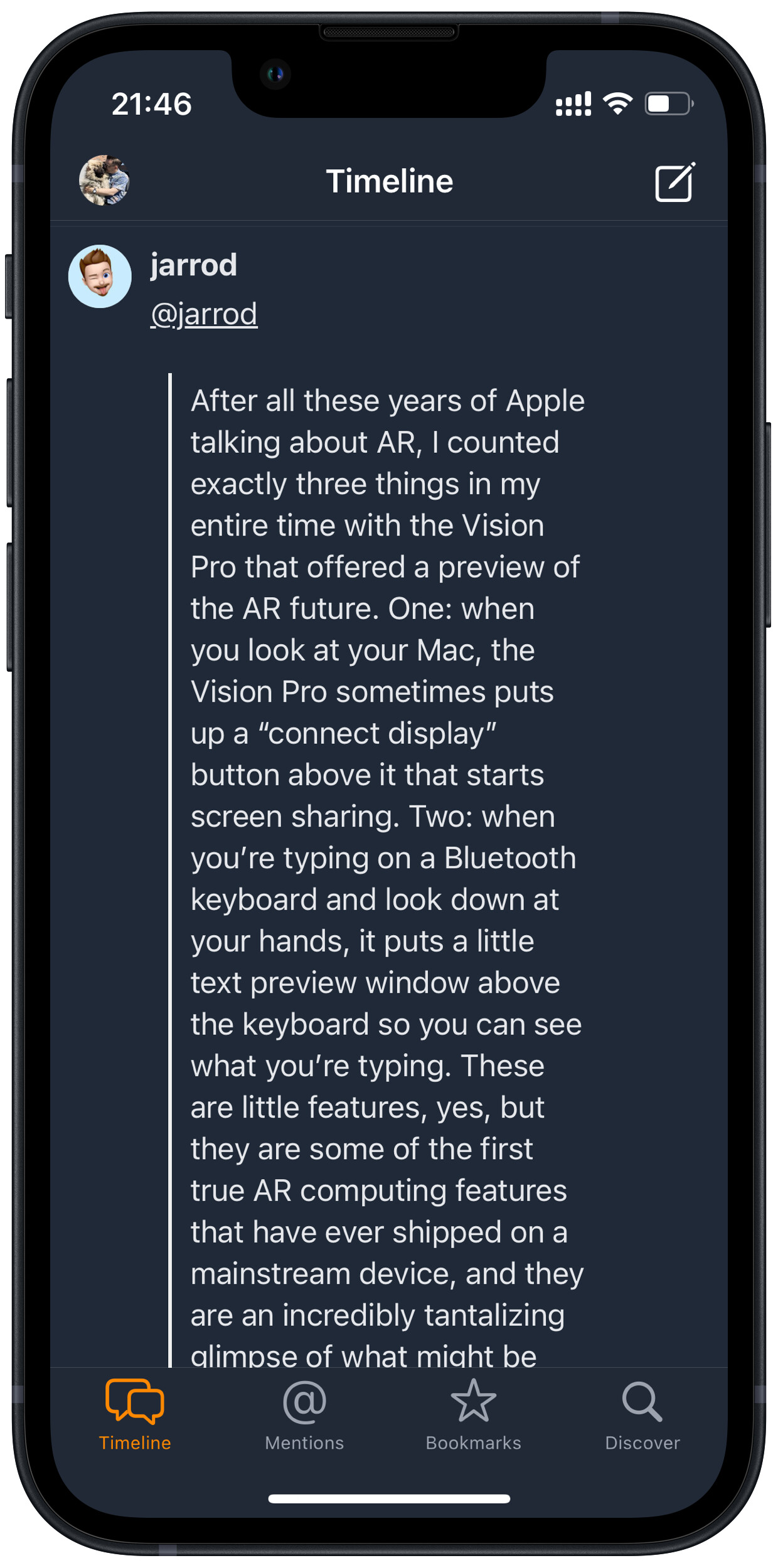
Micro.blog’s margins:
159px margins on the left side and 108px margins on the right side. (Why is it lopsided?)
Margins = 267px ≈ 24,7 % of the vw
Content = 813 px ≈ 75,3 % of the vw
In this post, the text uses 512px of height and 8 lines.
The image becomes 813px x 406px = 330 078
Are you really telling me that aligning the post text with the name is worth going from spending 7 % to spending 25 % on margins, and making every image on the timeline 35 % smaller?
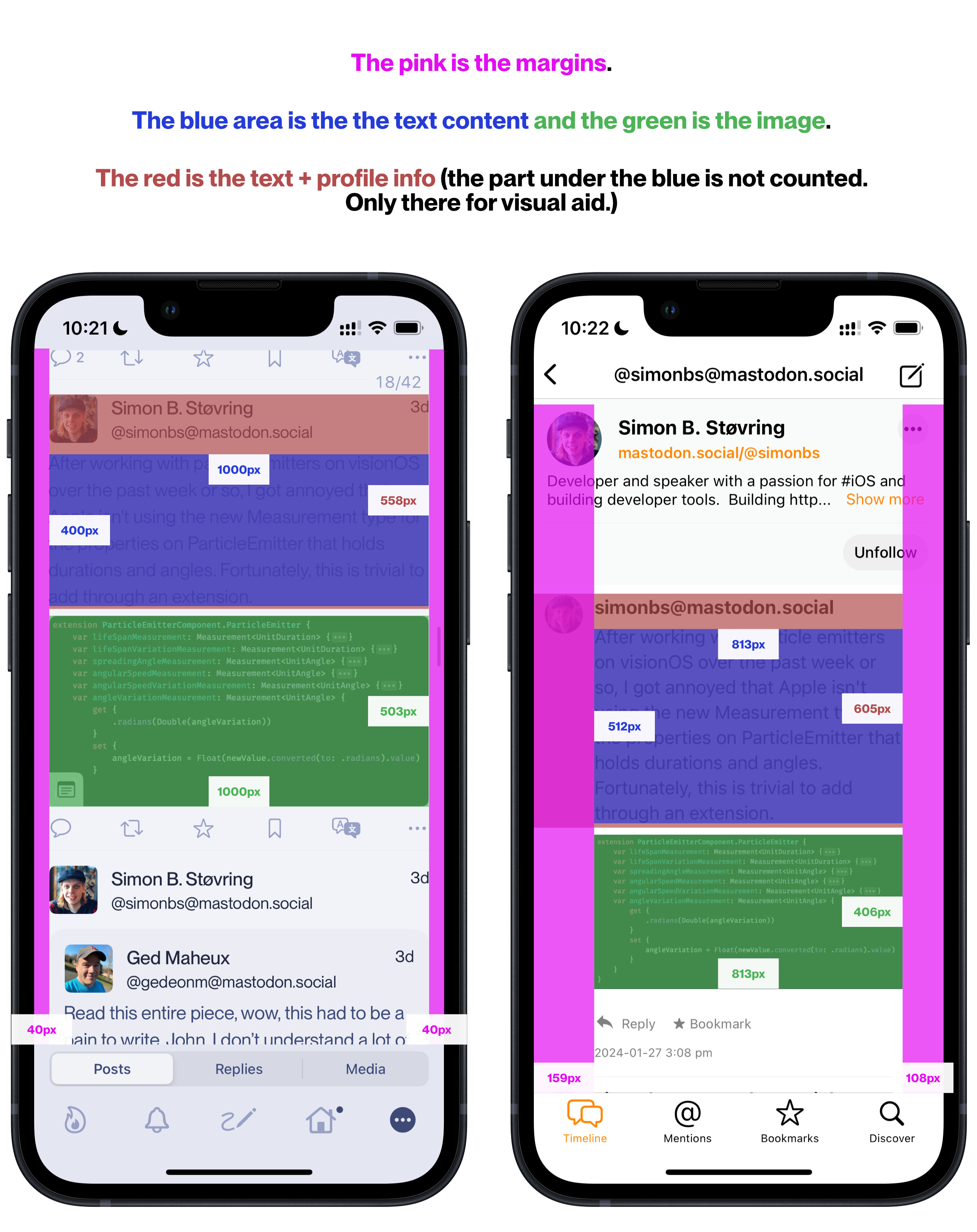
But what if you check for height including the name and avatar? As you said, having the margins makes it possible to move the post content up a bit.
Mona = 558px
Micro.blog = 605px
So even though Micro.blog has
- smaller avatar size,
- lower line height
- and doesn’t show the display name (I wish I could choose username, display name or both, btw.)
it still uses 8 % more vertical space.
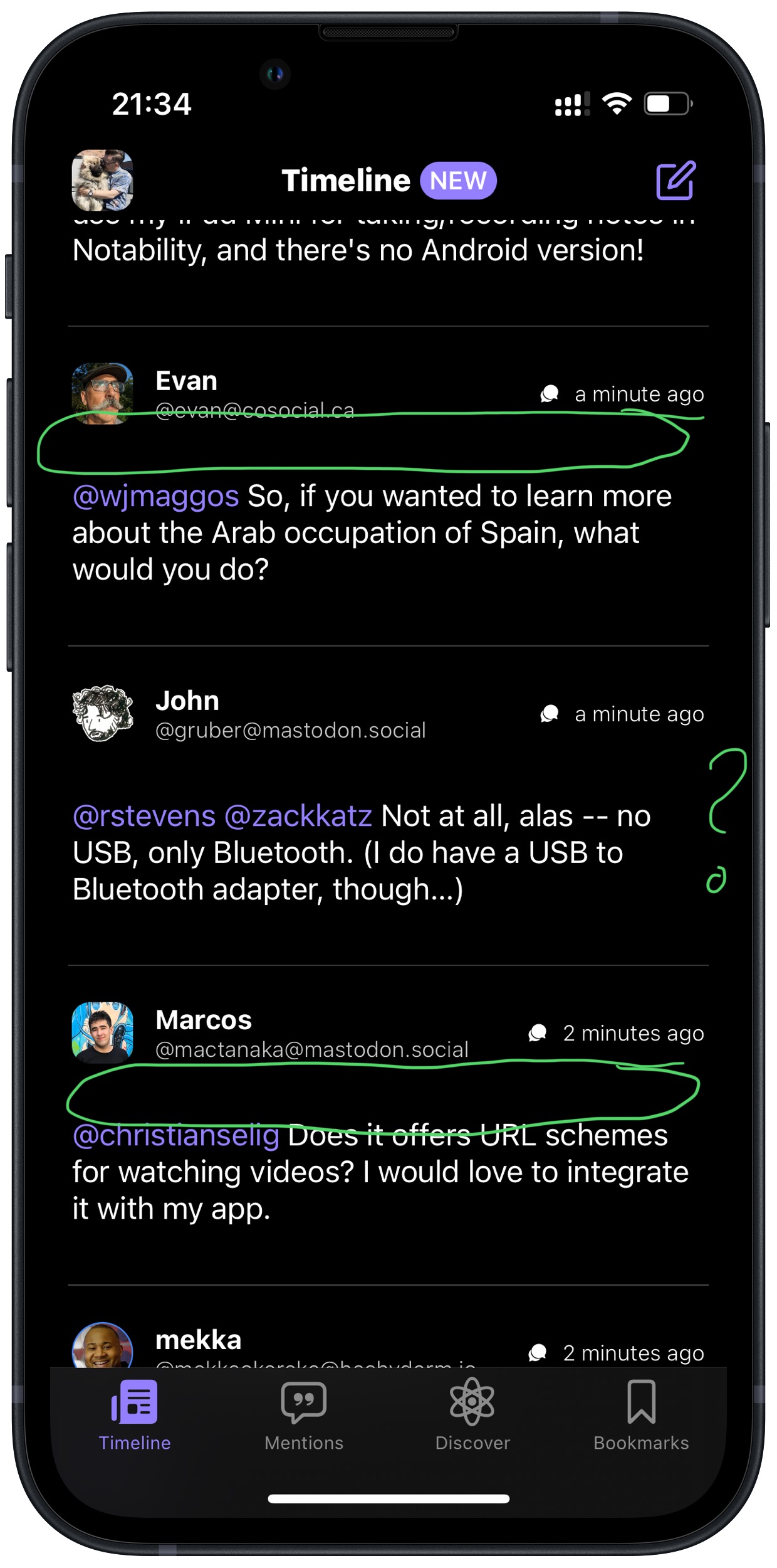
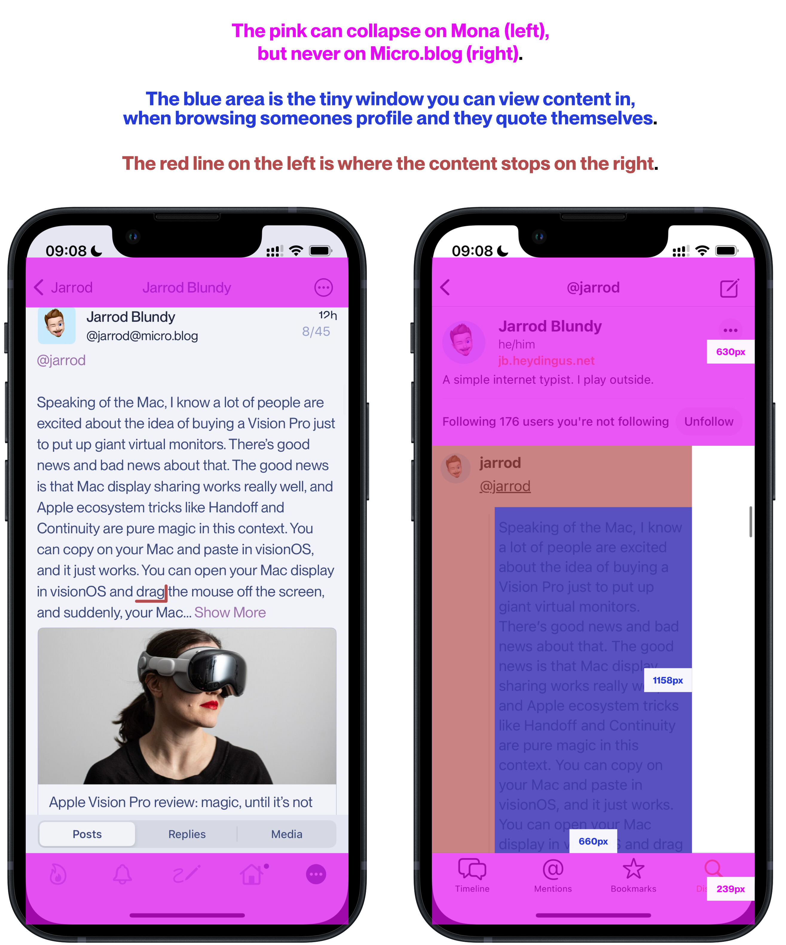
Browsing with an iPhone Mini is especially bad when visiting profiles. Here I’m visiting a Micro.blog profile (so everything is “native”):
Firstly, the margin problem gets extra bad with quotes.
Secondly, the bar up top with the profile info never collapses (on Mona you can choose if you want the top bar, bottom bar or both collapsing while scrolling). So there’s very little space left for content.
(The red line on the left screenshot is where the content stops on Micro.blog. And there’s also an extra line shift, below @jarrod, that’s not needed - but I think it’s on both.)
Proposed solutions
I know I’m hammering on a bit here - but it’s with love! (Micro.blog is so close to something I’d really love.) But to try and help a bit, and not just complain - here’s some proposed solutions. (Also, I know it’s easier to move things in vector than actually program.  )
)
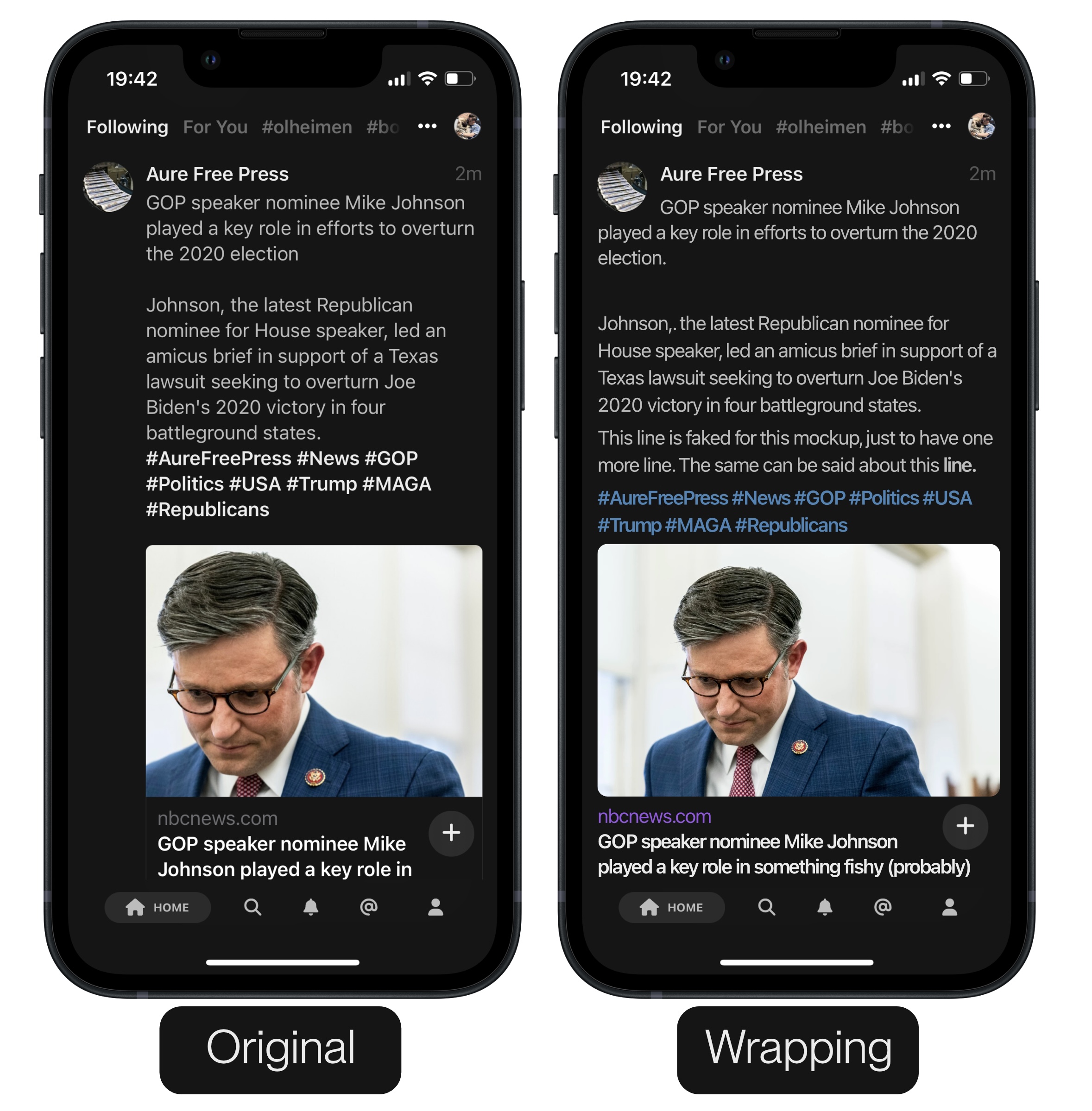
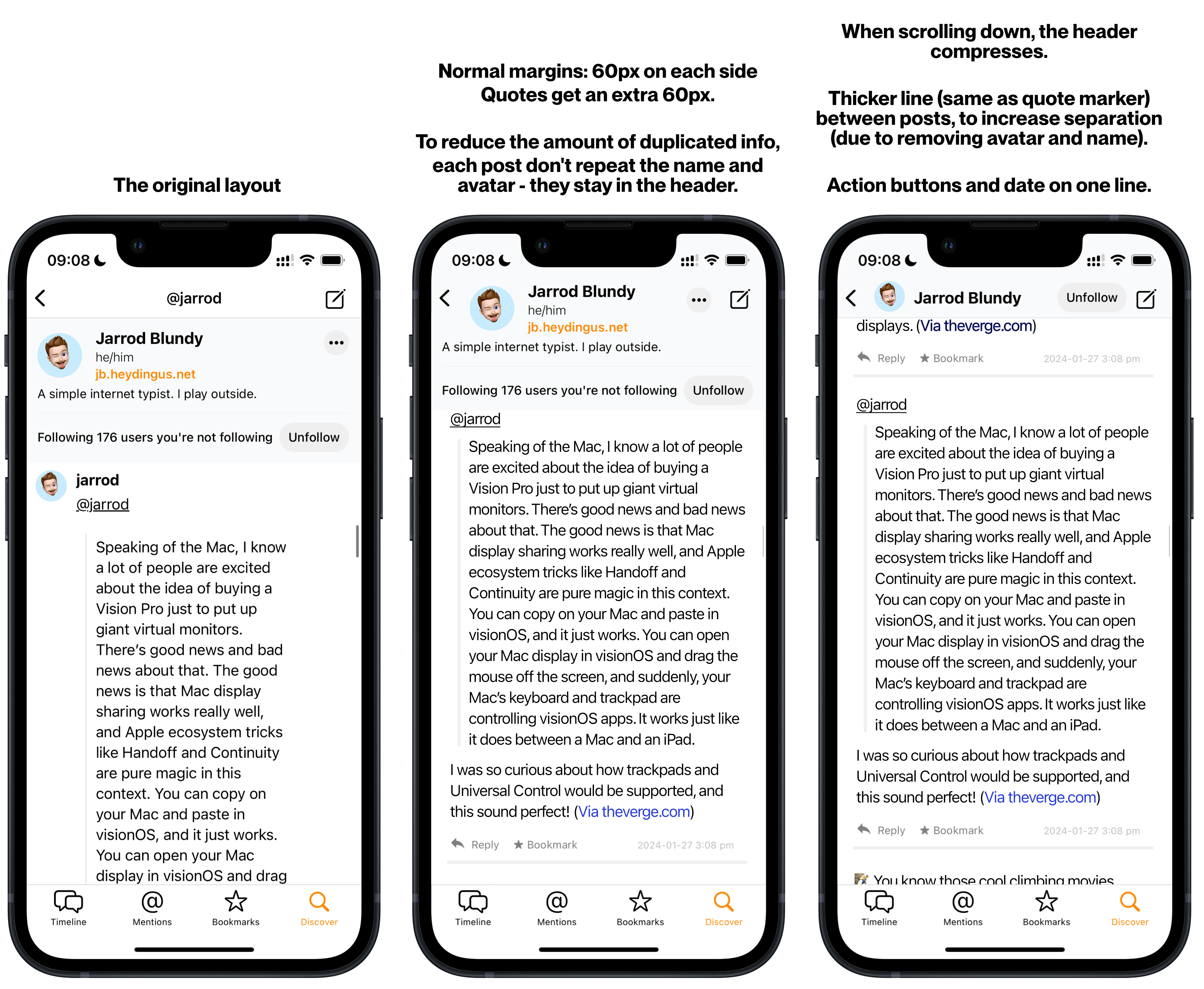
A bit out there: Wrapping the text (or just copy Mona)
I posted this mockup in my last post, which was one idea for the Mammoth app - wrapping:
Notice that they, like you, don’t show both username and display name - so the wrapping is a way to move the text up (like you mentioned). But I totally get that it’s a bit opinionated, as it obviously doesn’t align all the lines of text.
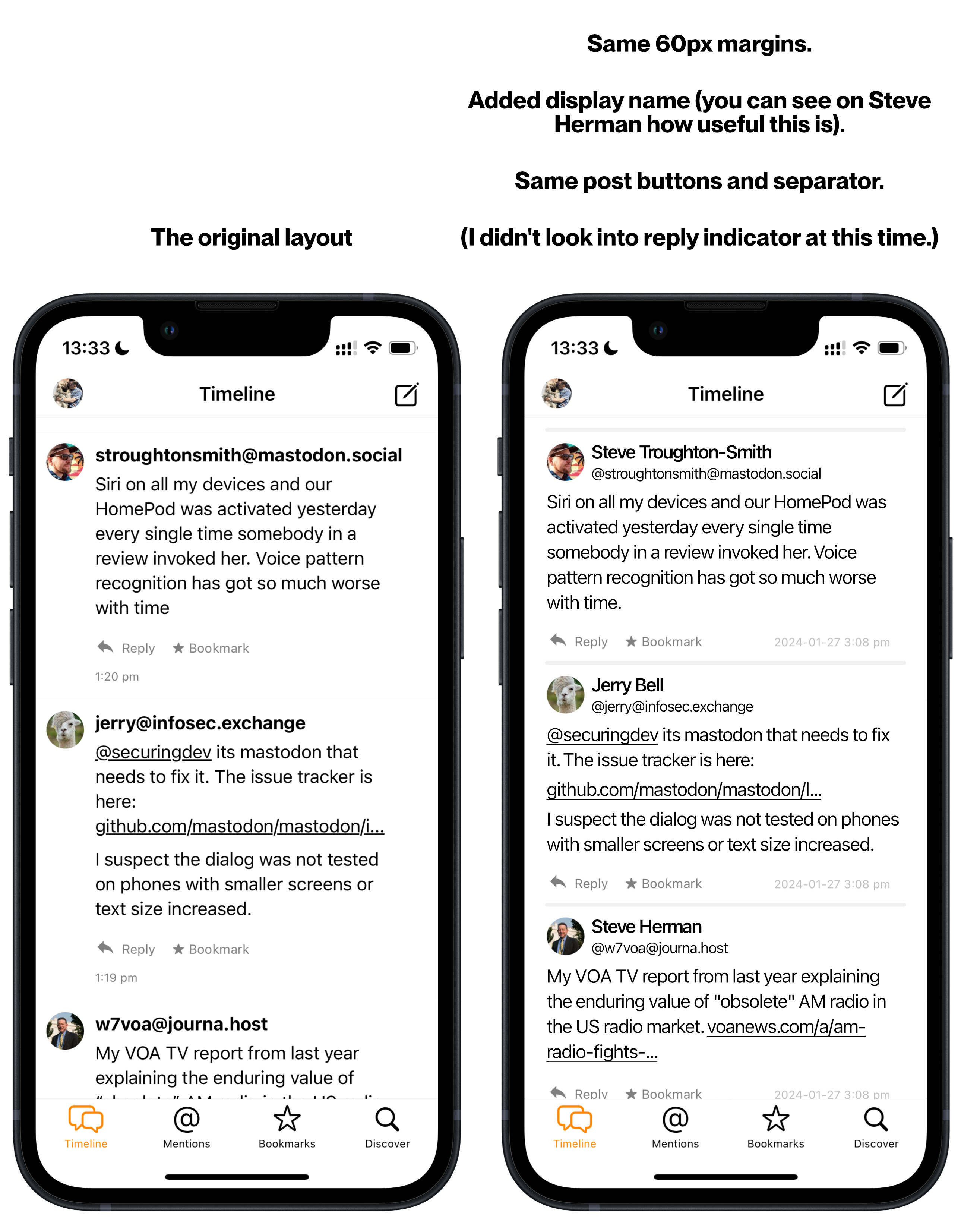
A way reduced margins could look:
Here’s a more sensible solution than wrapping. (And I made the margins 60px, not 40px, to make the change less jarring. But 40px might work just as well.) I love that you render block quotes - but since you have the line, you almost don’t have to increase the margin.
Browsing profiles
Browsing the timeline
(I wanted to make the mockup with several posts - but none of them were quotes or had images, which is what will benefit the most from margins like this.)
It could also be possible to look into stealing the replies indicator from Mona - but I didn’t play with that now: