I was wondering if anyone can see an easy way to reduce the number of columns in masonry view?
I like my blog to be narrow in format and I have chosen a smaller body width than the default in Tiny Theme. I like having two columns on my Photos when viewing on my phone. But on wider screens I have four columns, which I don’t like. I’d prefer two columns on all screen sizes.
I have been tinkering with custom CSS and custom templates but with no luck. I’m really not sure what I’m doing. Can anyone help me?
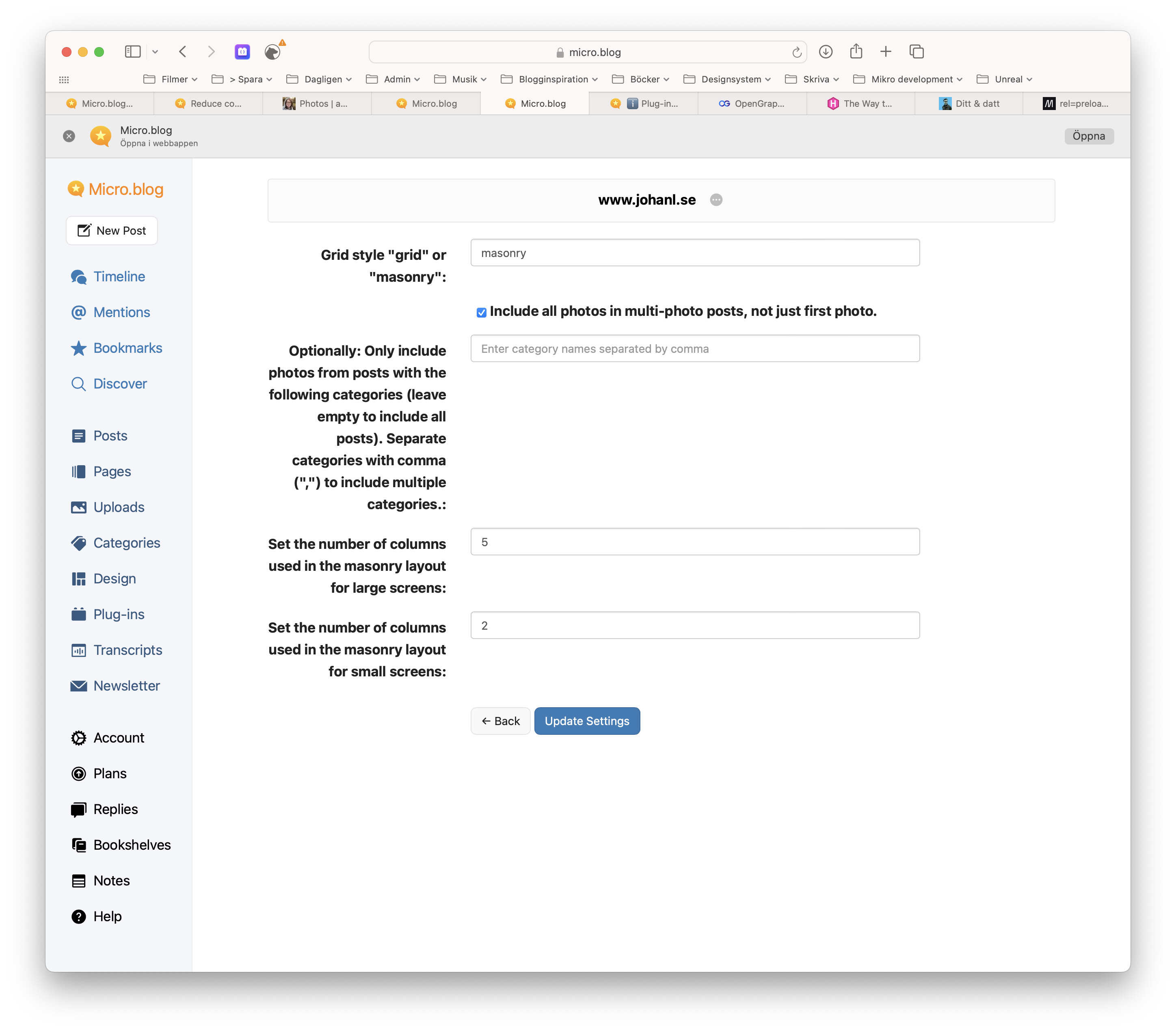
Hello @aeryn, thank you for trying out the Photos page plugin.
I’ve pushed out an update to the plugin that will let you control the number of columns used in the “masonry” layout for both small- and large screens.