Micro.blog will auto-generate Open Graph cards to use on your blog based on a setting and optional HTML templates. These cards are commonly used in social networks when linking to your blog.
On the Design page, you will see a choice between a few card styles. Plug-ins may add their own custom style, and those will also appear as a choice on the Design page.
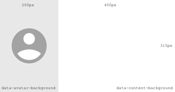
Open Graph cards are 600 x 315, and usually displayed at about half that size. Micro.blog adds your profile photo on the left side. The right side is available to a custom template, to include the post title, summary, images, or other information.
Templates may use simple logic similar to Hugo templates. They do not actually use Hugo, so special Hugo variables and commands are not available.
To add an Open Graph style to a plug-in, create a template layouts/opengraph.html.
You can control the two main background colors by adding data-avatar-background and data-content-background to the first <div> in your template. If these are left out, Micro.blog will use a light gray and white respectively.
The following special data attributes are available:
data-avatar-urldata-avatar-backgrounddata-content-background
Here’s an example template that changes the color to a light green:
<div style="background-color: #AFE1AF; padding: 40px;"
     data-content-background="#AFE1AF">
  {{ if .Title }}
     <b>{{ .Title }}</b>
  {{ end }}
  <p style="font-size: 15px;">{{ .Summary }}</p>
</div>
The color will usually need to be set in two places as in this example. The style color is for the <div>, which may be smaller than the full area, and the data-content-background is like the page background. Micro.blog will vertically center the content if it’s shorter than the available space.
Here’s what the default “Title + summary” template looks like, which uses the profile header if set (in Account → View Fediverse Settings):
<div style="position: relative; width: 400px; height: 315px; overflow: hidden;">
  <img src="{{ .Site.Author.header }}" height="100%" style="position: absolute; inset: 0; opacity: 0.2; z-index: 0;">
  {{ with .Title }}
    <div style="position: relative; z-index: 1; padding-left: 20px; padding-right: 20px; padding-top: 30px; padding-bottom: 10px; font-size: 25px; font-weight: bold;">
      {{ . }}
    </div>
  {{ end }}
  <div style="position: relative; z-index: 1; padding-left: 20px; padding-right: 20px; padding-top: 10px; padding-bottom: 20px; font-size: 20px;">
    {{ .Summary }}
  </div>
</div>
Note that not all of modern CSS is available. Micro.blog uses an older web renderer, so think back to what web standards were available around 2010.
The following fields are available:
.Site.Author.avatar(URL for profile photo).Site.Author.name.Site.Author.header(URL for profile header if available).Site.Title.Site.BaseURL.Site.Hostname.Site.Params(any named config parameter available from a plug-in).Title.Content(HTML).Plain.Summary(truncated to about 200 characters).Permalink.Date.Params.photos(array of photo URLs)