Newsletter width

I’m very happy with the newsletter capabilities in Micro.blog. Thank you for adding the option for daily frequency.

I would be even happier if we could control the width of the newsletter. I’ve seen from searching this forum that this has been a problem in the past — has it been solved? I subscribe to many newsletters and the Micro.blog newsletters seem to be the only one with this problem. How do other newsletters solve this problem? Can this solution be implemented in MB?

And I would be even happier still if my newsletter looked just like the Alpine template I’m currently using for my blog. (Though I must disclose that I am a habitual template-switcher, and with news from MTT that the Tiny Theme V2 and V3 are on their way, I may just switch again.)

What kind of width control would you like? Is the problem that it’s sometimes too wide and not fitting on small screens? If so, that should be something that a little CSS could fix.

If you have a screenshot of the problem, post it in this thread. Thanks!

Here you are. The images look fine, but the text posts are too wide. For your convenience, I put arrows next to the text posts.

I do plan to look at the Sumo theme from @Mtt when that’s available — perhaps that will solve the problem? For now, I’m using the Alpine theme. I switch occasionally between Alpine and Tiny.

Any word on this?

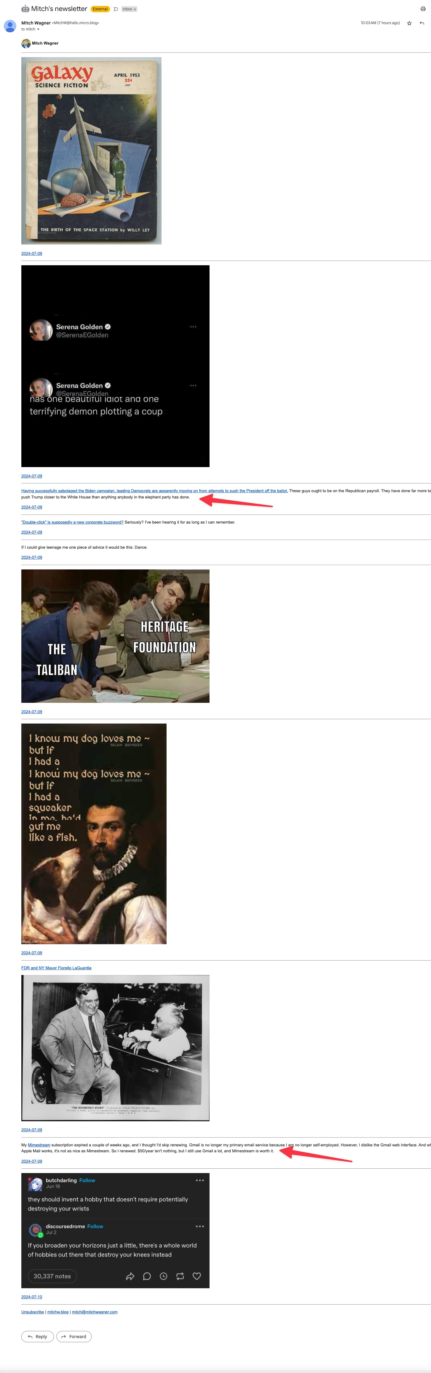
The Micro.blog newsletters now appear full width of the window with no separation between individual items, which does not look great.

I’d like to have the newsletter body appear as, say, 50% of the window width on a desktop monitor or tablet, and also include a little bit of space and a horizontal rule between items.

A design like the Sumo or Alpine blog, but in the newsletter, would be fine.

I have zero CSS skills so cannot code this myself. I think this design would be useful for other people as well.

If this is something that Micro.blog isn’t interested in implementing, please let me know.

Thanks!

Standardizing the width of inline attachments would go a long way to make the newsletters more readable, for sure.

This issue was a big part of the reason I moved back to MailChimp from Micro.blog newsletter hosting.

I’m in the process of moving my newsletter back to Micro.blog. I am dissatisfied with my MailChimp/Tumblr setup. Micro.blog is better.

I encounter the problem with the newsletter width in Gmail on the desktop, both viewed on the web and in Mimestream.

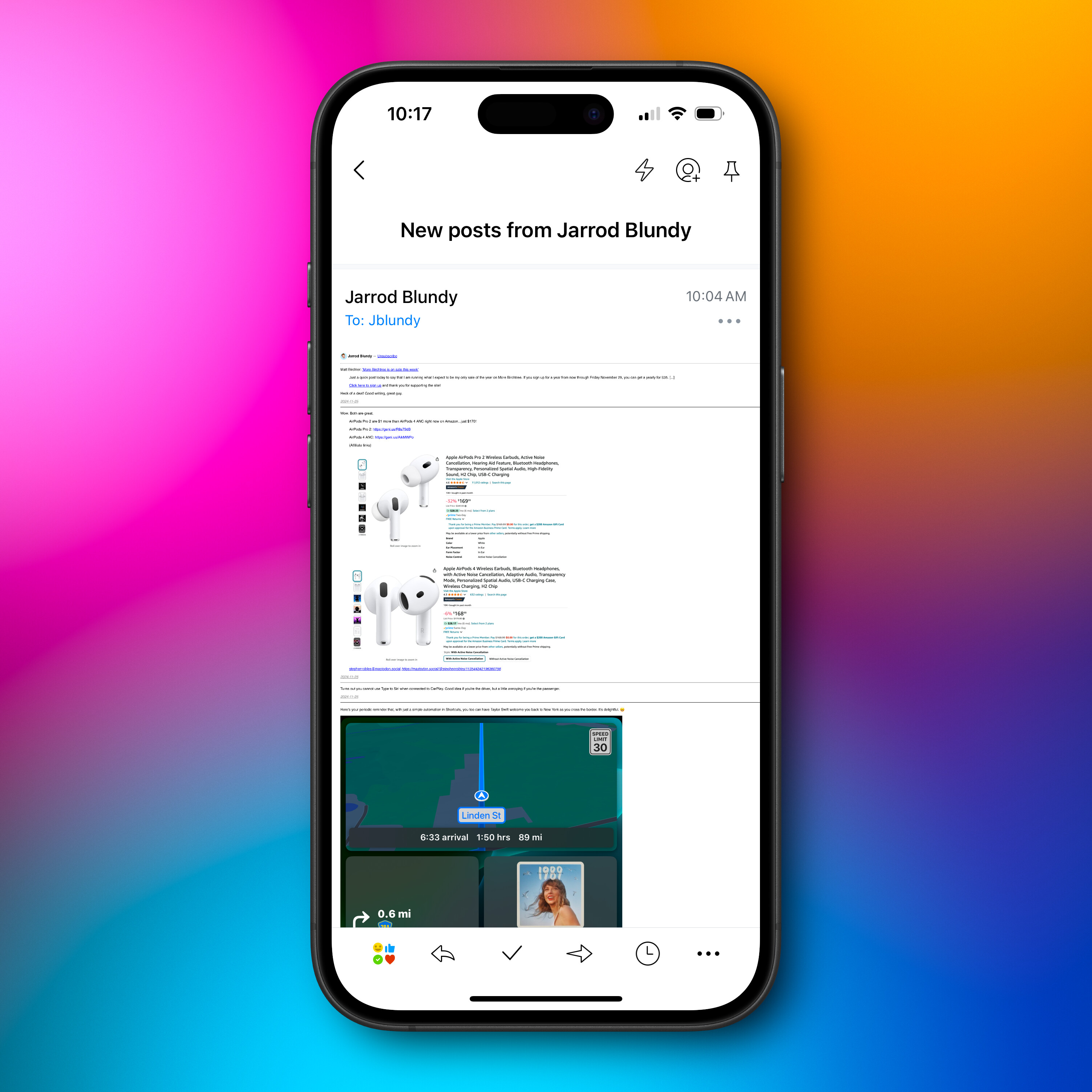
The newsletter looks great in the Gmail app on my iPhone, but of course, there isn’t much width for it to spread out.

I’ve set up a test account on iCloud, which I will access in Apple Mail and see if the problem recurs there when the next newsletter goes out tomorrow.

Update: I see the same problem on iCloud using Apple Mail as a client. I switched to the Alpine theme for this experiment, figuring that if I used the same theme as @manton I’d eliminate a possible source of error.

The newsletter spreads out to the full width of the window, rather than limiting itself to a readable width.

This is not a problem with a Patreon newsletter, a couple of Axios newsletters, the New York Times newsletter, and a couple of local newspaper newsletters I subscribe to. It is also not a problem for Casey Newton’s Platformer, which is, I think, hosted on Beehiiv. All of these limit themselves to a readable width no matter what email client I use.

At some point I may put ChatGPT or Claude to work on this and see if it can generate CSS to correct the problem. holdmybeer.gif

Hello @MitchWagner!
I think you might find your answer in setting the max-width css property on the element containing paragraph.

For example, in the sumo newsletter template, it has the style at the top and everything is found in microblog_email div class. So you would add something like the following.

.microblog_email {
  max-width: 700px;
}

Here is Mozilla’s page about the property.

1 Like

Love it! And your example is well chosen; I happen to be using the sumo style for my blog. I’ll give this a try straightaway. Thank you!

Will this work? I pasted the snippet where you suggested.

Feature request for @manton: Please add the ability to send a test email!

<style>
	a {
		color: #1565C0;
	}

	a:hover {
		text-decoration: none;
	}

	.microblog_permalink {
		color: #1565C0;
		font-size: 0.9em;
		text-decoration: none;
	}

	.email-profile-photo {
		border-radius: 80px;
		vertical-align: middle;
		max-width: 80px;
	}

	.microblog_footer {
		border-top: 1px solid #1565C0;
		padding-top: 5px;
		margin-top: 5px;
	}

	img {
		border-radius: 5px;
		width: 100%;
		height: auto;
		max-width: 1000px;
	}

	.intro {
		border-bottom: 1px solid #1565C0;
		padding-bottom: 20px;
	}

	.post {
		margin-top: 10px;
		margin-bottom: 10px;
	}
</style>

<div class="microblog_email">

.microblog_email {
  max-width: 700px;
}

	<img src="{{ .Site.Author.avatar }}" width="80" height="80" alt="Profile icon" class="email-profile-photo">
	<h2>{{ .Site.Title }}</h2>

	{{ if gt (len .Intro) 0 }}
	<div class="intro">
		{{ .Intro }}
	</div>
	{{ end }}

	{{ range .Pages }}
	<div class="post">
		<a href="{{ .Permalink }}" class="microblog_permalink">{{ .Date.Format "Jan 2, 2006" }} ↓</a>

		{{ if .Title }}
		<h3>{{ .Title }}</h3>
		{{ end }}
		{{ .Content }}

		{{ if gt (len .Params.audio) 0 }}
		<a href="{ .Permalink }">Audio</a>
		{{ end }}

		{{ if gt (len .Params.video) 0 }}
		<a href="{ .Permalink }">Video</a>
		{{ end }}
	</div>
	{{ end }}

	<div class="microblog_footer">

		<a href="{{ .Footer.UnsubscribeURL }}">Unsubscribe</a> <span class="microblog_divider">|</span>

		{{ if eq (len .Pages) 1 }}
		{{ with index .Pages 0 }}
		<a href="{{ .Permalink }}">View in browser</a> <span class="microblog_divider">|</span>
		{{ end }}
		{{ end }}

		<a href="{{ .Site.BaseURL }}">{{ .Site.Hostname }}</a>

		{{ if gt (len .Footer.MailingAddress) 0 }}
		<span class="microblog_divider">|</span> {{ .Footer.MailingAddress }}
		{{ end }}

	</div>

</div>

You can’t put CSS outside of the <style> tags.

1 Like

OK, trying this again — and this time I asked ChatGPT for help.

First problem: There are two places with a newsletter template to edit: On the blog design page and on the Newsletter page. ChatGPT said to make the edits on the newsletter page.

I uploaded the CSS from that setting to ChatGPT and asked it how to fix the newsletter template to control newsletter width.

The chat is short, so I’m just going to link to it right here.

Will this work?

all you have to do is move this part up to between the <style></style> tags right after the .post {} block. You just can’t have stray CSS in your document not between the style tags. You could probably just add that one part quoted above into the custom CSS on the design page, though I’m not positive/confident that’s used by the newsletter template, so I’d go with just moving the lines above.

You don’t need to add the additional container or anything else from ChatGPT.

Thanks again!

How’s this?

<style>
	a {
		color: #1565C0;
	}

	a:hover {
		text-decoration: none;
	}

	.microblog_permalink {
		color: #1565C0;
		font-size: 0.9em;
		text-decoration: none;
	}

	.email-profile-photo {
		border-radius: 80px;
		vertical-align: middle;
		max-width: 80px;
	}

	.microblog_footer {
		border-top: 1px solid #1565C0;
		padding-top: 5px;
		margin-top: 5px;
	}

	img {
		border-radius: 5px;
		width: 100%;
		height: auto;
		max-width: 1000px;
	}

	.intro {
		border-bottom: 1px solid #1565C0;
		padding-bottom: 20px;
	}

	.post {
		margin-top: 10px;
		margin-bottom: 10px;
	}

	.microblog_email {
		max-width: 700px;
	}

</style>

<div class="microblog_email">
	<img src="{{ .Site.Author.avatar }}" width="80" height="80" alt="Profile icon" class="email-profile-photo">
	<h2>{{ .Site.Title }}</h2>

	{{ if gt (len .Intro) 0 }}
	<div class="intro">
		{{ .Intro }}
	</div>
	{{ end }}

	{{ range .Pages }}
	<div class="post">
		<a href="{{ .Permalink }}" class="microblog_permalink">{{ .Date.Format "Jan 2, 2006" }} ↓</a>

		{{ if .Title }}
		<h3>{{ .Title }}</h3>
		{{ end }}
		{{ .Content }}

		{{ if gt (len .Params.audio) 0 }}
		<a href="{ .Permalink }">Audio</a>
		{{ end }}

		{{ if gt (len .Params.video) 0 }}
		<a href="{ .Permalink }">Video</a>
		{{ end }}
	</div>
	{{ end }}

	<div class="microblog_footer">

		<a href="{{ .Footer.UnsubscribeURL }}">Unsubscribe</a> <span class="microblog_divider">|</span>

		{{ if eq (len .Pages) 1 }}
		{{ with index .Pages 0 }}
		<a href="{{ .Permalink }}">View in browser</a> <span class="microblog_divider">|</span>
		{{ end }}
		{{ end }}

		<a href="{{ .Site.BaseURL }}">{{ .Site.Hostname }}</a>

		{{ if gt (len .Footer.MailingAddress) 0 }}
		<span class="microblog_divider">|</span> {{ .Footer.MailingAddress }}
		{{ end }}

	</div>

</div>

I suspect that will work.

We’ll find out later today when the next newsletter goes out. #HoldMyBeer Thanks very much.

(Yes, my newsletter goes out 5 pm local time, rather than 9 am like it’s supposed to. I haven’t reported it as a bug because I’m not sure whether I have a preference.)

Update: This works great. Thanks for the assistance, @jsonbecker and @mandaris !

Next, I will look into how to center the body of the newsletter.

Will this work to center the newsletter body?

<style>
	a {
		color: #1565C0;
	}

	a:hover {
		text-decoration: none;
	}

	.microblog_permalink {
		color: #1565C0;
		font-size: 0.9em;
		text-decoration: none;
	}

	.email-profile-photo {
		border-radius: 80px;
		vertical-align: middle;
		max-width: 80px;
	}

	.microblog_footer {
		border-top: 1px solid #1565C0;
		padding-top: 5px;
		margin-top: 5px;
	}

	img {
		border-radius: 5px;
		width: 100%;
		height: auto;
		max-width: 1000px;
	}

	.intro {
		border-bottom: 1px solid #1565C0;
		padding-bottom: 20px;
	}

	.post {
		margin-top: 10px;
		margin-bottom: 10px;
	}

	.microblog_email {
		max-width: 700px;
		margin: auto;
	}

</style>

<div class="microblog_email">
	<img src="{{ .Site.Author.avatar }}" width="80" height="80" alt="Profile icon" class="email-profile-photo">
	<h2>{{ .Site.Title }}</h2>

	{{ if gt (len .Intro) 0 }}
	<div class="intro">
		{{ .Intro }}
	</div>
	{{ end }}

	{{ range .Pages }}
	<div class="post">
		<a href="{{ .Permalink }}" class="microblog_permalink">{{ .Date.Format "Jan 2, 2006" }} ↓</a>

		{{ if .Title }}
		<h3>{{ .Title }}</h3>
		{{ end }}
		{{ .Content }}

		{{ if gt (len .Params.audio) 0 }}
		<a href="{ .Permalink }">Audio</a>
		{{ end }}

		{{ if gt (len .Params.video) 0 }}
		<a href="{ .Permalink }">Video</a>
		{{ end }}
	</div>
	{{ end }}

	<div class="microblog_footer">

		<a href="{{ .Footer.UnsubscribeURL }}">Unsubscribe</a> <span class="microblog_divider">|</span>

		{{ if eq (len .Pages) 1 }}
		{{ with index .Pages 0 }}
		<a href="{{ .Permalink }}">View in browser</a> <span class="microblog_divider">|</span>
		{{ end }}
		{{ end }}

		<a href="{{ .Site.BaseURL }}">{{ .Site.Hostname }}</a>

		{{ if gt (len .Footer.MailingAddress) 0 }}
		<span class="microblog_divider">|</span> {{ .Footer.MailingAddress }}
		{{ end }}

	</div>

</div>

I added this line

margin: auto;

to the

.microblog_email {
  max-width: 700px;

bit

The previous CSS works in Apple Mail and Mimestream but not in the Gmail web application.

Based on my cursory web searching, Gmail and Microsoft disallow certain CSS, and I believe that includes margin: auto.

If anybody knows of a not-too-hairy workaround for this, I’ll be grateful to see it.

Otherwise, I’m going to take the W and move on — for now. Maybe I’ll see if I can get it to work in Gmail another day.

Thanks again to @jsonbecker and @mandaris mandaris for their assistance.