Hello! @manton
Can you make navigation menu buttons: Bookmarks and Discover on the mobile version of the website fit on screen in vertical orientation?
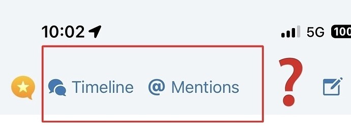
Here is how it looks on the mobile version of Micro.Blog in vertical orientation:
Because these two buttons: Bookmarks and Discover don’t fit on the screen in vertical orientation on mobile devices.
Here is how it looks on the mobile version of Micro.Blog in horizontal orientation:
And here are nowhere links to them on the mobile version of the website… ![]()
P.S. Maybe you can move them on mobile version of Micro.blog under: Timeline and Mention buttons.
Here is my suggestion for the mobile version of Micro.Blog in vertical orientation:
Thank you!


