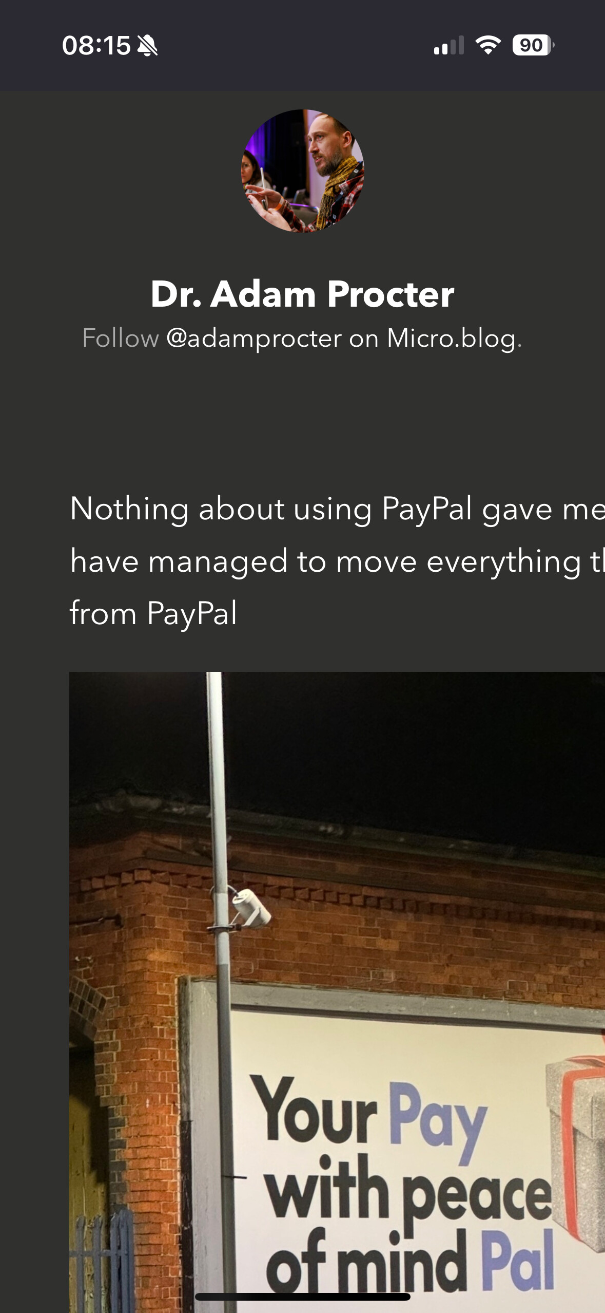
I am pretty confident my screen width gets broken due to photos being too wide if anyone can tell me a quick CSS fix for small screens that will resolve this as I end up bumbling around and can’t find which file to edit
So when you load the page you get text and photos half off screen
I previewed it on my phone and it looked OK, but page was def overspilling /was too wide when testing in dev tools in my browser in ‘mobile-view’.
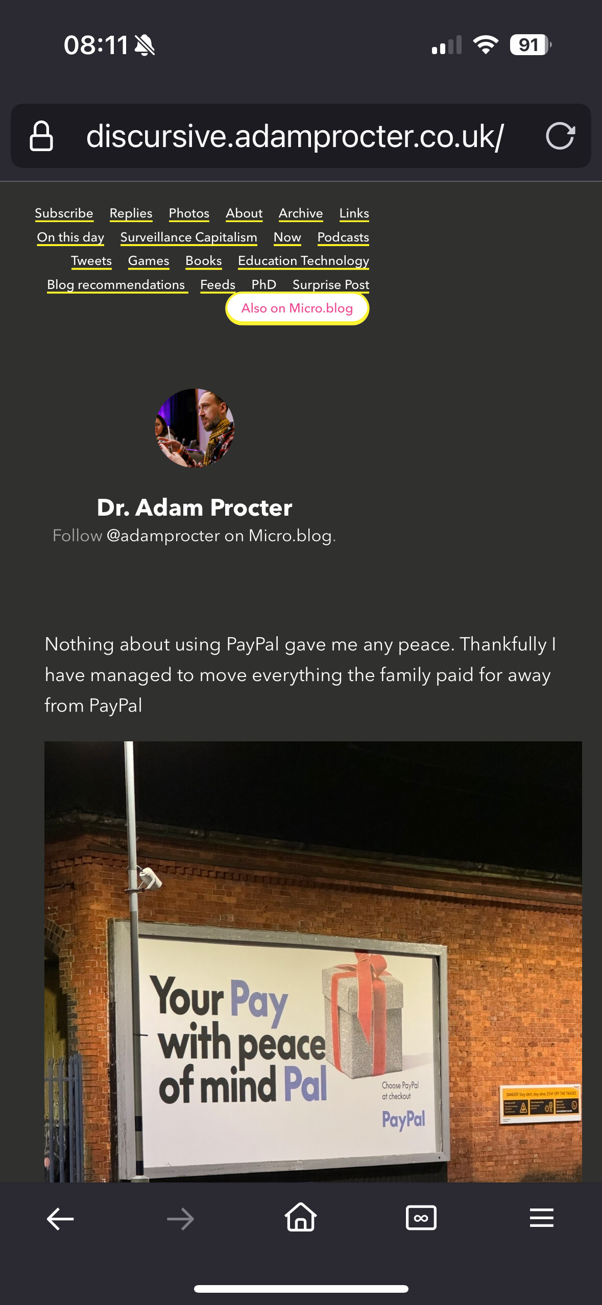
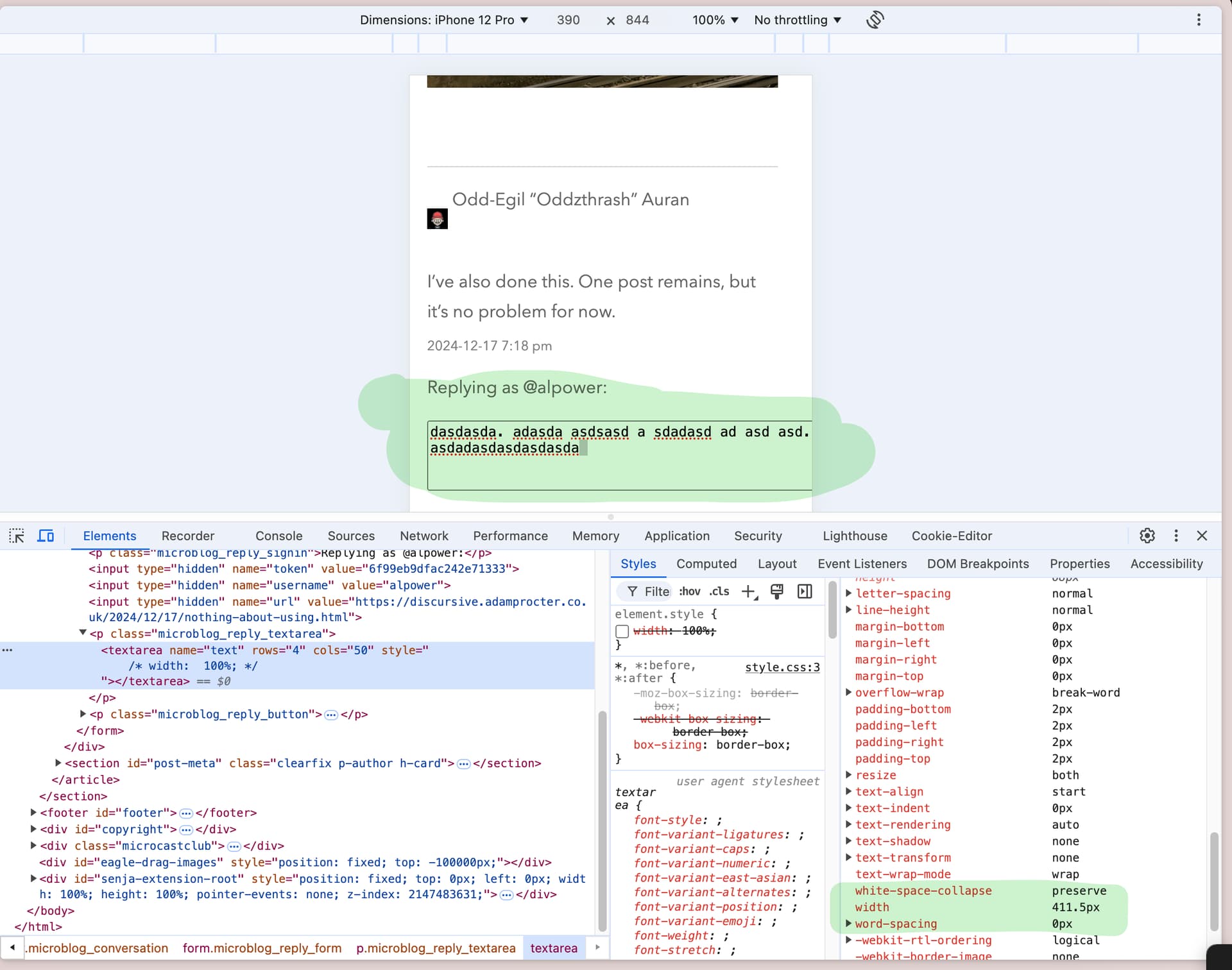
The image looked fine and was 100% width, but the only thing I found that could be pushing it off was that the reply text area didn’t have a width set, so was resizing based on it’s col="50" attribute, so made the overall screen wider than the mobile viewport.
Setting a width="100%" in CSS for the reply text area fixed this.
I now recall why I am struggling to fix this as its not replicable on browsers on mac with responsive design view… and also most people report it is ok… so what is my iPhone browsers doing !