I’m trying to modify the Tiny Theme to get hierarchical menus and I’m partly successful. I looked up some code on the internet and have some kind of hierarchical menu but unfortunately it doesn’t look the way I want. The main problem is that I haven’t used CSS in a long time and is probably 10 generations behind everyone else.
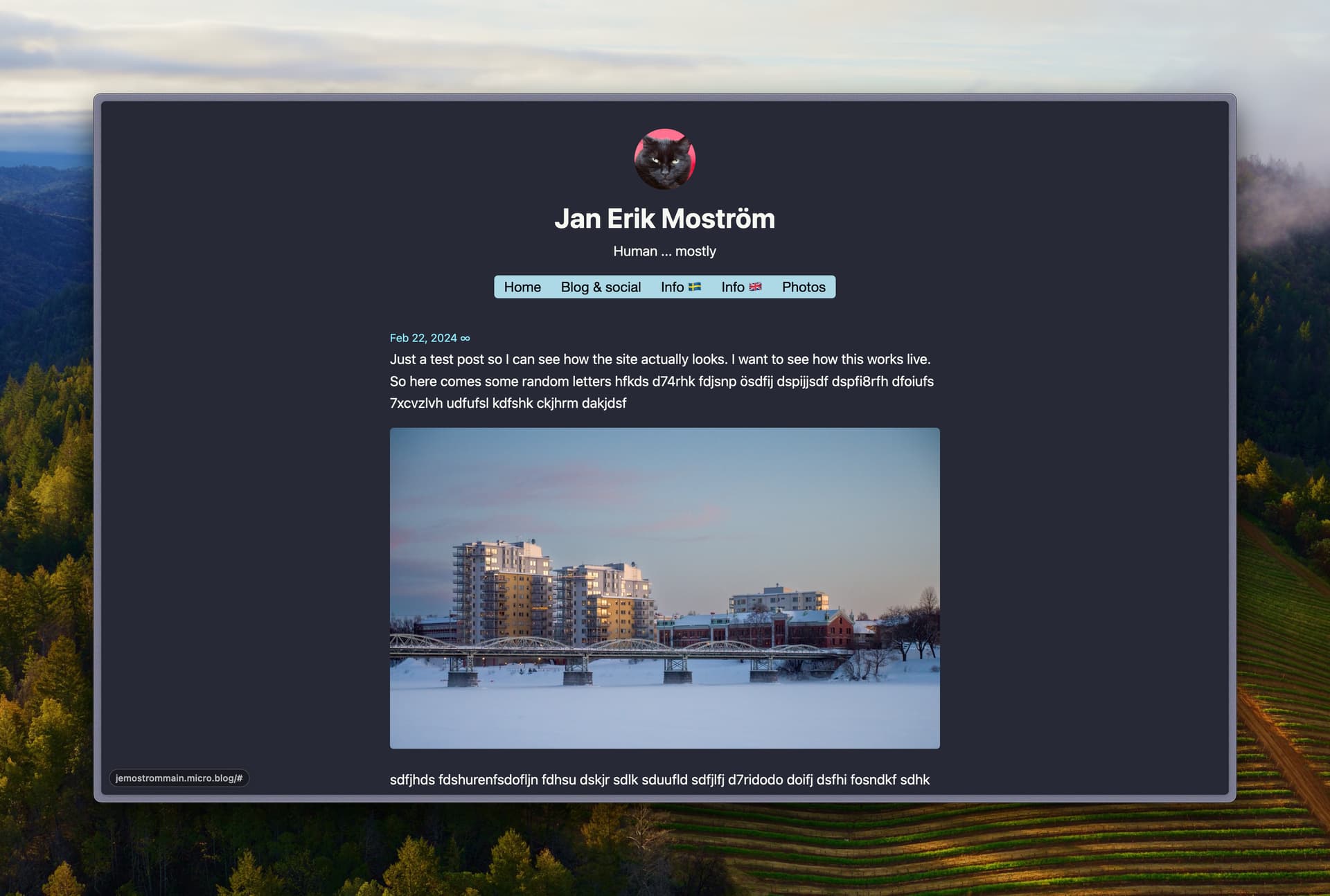
Anyway, the site is at https://jemostrommain.micro.blog/ and I’m trying to do two things:
- getting more space between the menus and page content
- center the navigation bar, hmm I should probably center the whole header
I’m using this CSS snippet
#menu {
	padding-bottom:100px;
    display: block;
    background-color: blue;
    text-align: center;
}
The blue background is only for me to see where the menu is … and yes, I don’t want to have a 100px spacing there, I just want to see what happens. I’m probably doing something really, really wrong but I lack the CSS knowledge to understand what is wrong.
Does anyone have any advise on how I can fix this?
Here is the CSS for the hierarchical menu part
/*Strip the ul of padding and list styling*/
ul {
    list-style-type:none;
    margin:0;
    padding:0;
    position: absolute;
}
/*Create a horizontal list with spacing*/
li {
    display:inline-block;
    float: left;
    margin-right: 3px;
margin-left: 3px;
}
/*Style for menu links*/
li a {
    display:block;
    /* height: 50px; */
    margin: 0 10px;
    text-align: left;
    line-height: 30px;
    font-family: "Helvetica Neue", Helvetica, Arial, sans-serif;
    color: #000;
    text-decoration: none;
}
/*Hover state for top level links*/
li:hover a {
    background: #19c589;
}
/*Style for dropdown links*/
li:hover ul a {
    background: #f3f3f3;
    color: #2f3036;
    height: 40px;
    line-height: 40px;
}
/*Hover state for dropdown links*/
li:hover ul a:hover {
    background: #19c589;
    color: #fff;
}
/*Hide dropdown links until they are needed*/
li ul {
    display: none;
}
/*Make dropdown links vertical*/
li ul li {
    display: block;
    float: none;
}
/*Prevent text wrapping*/
li ul li a {
    width: auto;
    min-width: 100px;
    padding: 0 20px;
}
/*Display the dropdown on hover*/
ul li a:hover + .hidden, .hidden:hover {
    display: block;
}
/*Style 'show menu' label button and hide it by default*/
.show-menu {
    font-family: "Helvetica Neue", Helvetica, Arial, sans-serif;
    text-decoration: none;
    color: #fff;
    background: #19c589;
    text-align: center;
    padding: 10px 0;
    display: none;
}
/*Hide checkbox*/
input[type=checkbox]{
    display: none;
}
/*Show menu when invisible checkbox is checked*/
input[type=checkbox]:checked ~ #menu{
    display: block;
}
/*Responsive Styles*/
@media screen and (max-width : 760px){
    /*Make dropdown links appear inline*/
    ul {
        position: static;
        display: none;
    }
    /*Create vertical spacing*/
    li {
        margin-bottom: 1px;
    }
    /*Make all menu links full width*/
    ul li, li a {
        width: 100%;
    }
    /*Display 'show menu' link*/
    .show-menu {
        display:block;
    }