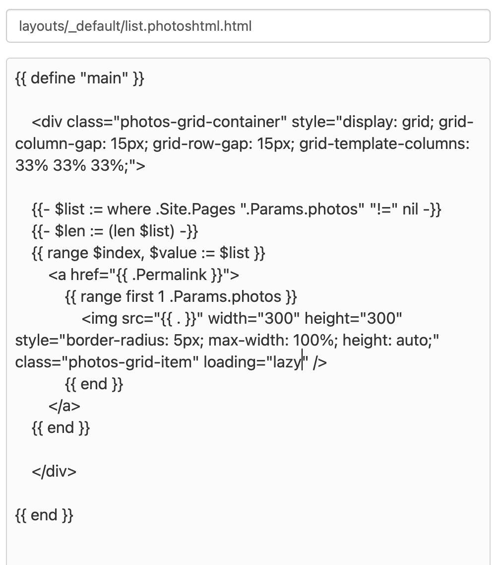
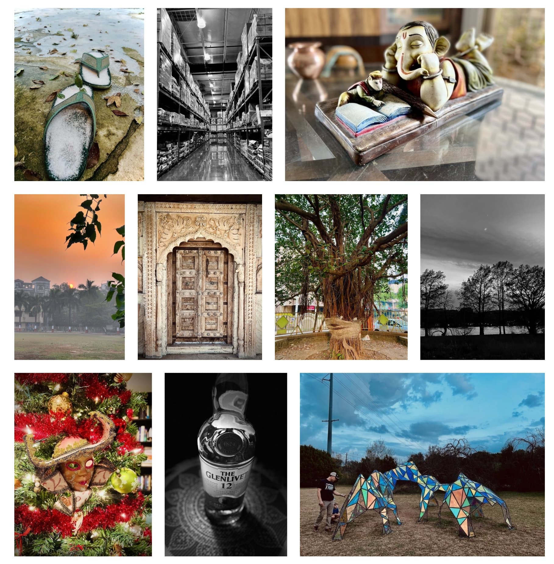
Currently, in the defaults MB view, there’s a lot of white space if you post a mix of landscape and portrait images. Also, sometimes I do custom crops that otherwise wouldn’t be obvious but are in the photos view. See below:
Yeah, Cypress is very close to what you want, I think. Maybe it would be best to extract the Cypress photos page template into a plug-in that could be used in any theme?
I took a first pass at a plug-in using the Masonry library, but the layout gets jumbled if Masonry doesn’t yet know the width/height of the images. I think it will need more work before it’s usable.
Thanks, Manton. Let’s hope someone well versed in plugins can take this further. I’m sure we will see more Photos pages included in the Menu if this plugin is created.
I believe CSS Grid can get you some, if not all, of the way there. Just wrap the whole thing in a tag like div and give it a class name like gallery, then in your CSS add something like this:
.gallery { display: grid; grid-template-columns: repeat(auto-fit, minmax(200px, 1fr)); gap: 10px; /* can be any value you’d like */ }
The auto-fit parameter fits as many photos to whatever the width of the container is to a minimum of 200px before it wraps around to the next row.
You don’t need to add the div tag anywhere since “photos-grid-container” would be it, but I’m sorry, I misunderstood your original post. The example image you posted all looked to be the same size to me, so I thought a simple grid-template-columns: repeat(auto-fit, minmax(200px, 1fr)); would do the trick, but that won’t work for a masonry-type of layout, in which portrait and landscape photos all flow naturally with the same gap in between each photo. At the moment you would need Javascript like @jsonbecker pointed out. I updated my previous post with this link pointing to native CSS masonry that’s currently in the works. Maybe @manton’s plugin can help. Sorry about that @pratik!

 Count me in if you want a beta-tester.